Open a page in Composer in the site admin to change its layout and section presentation. This guide also points to the separate theme, site and menu controls for shared design changes.
Checked against the product’s code on 7 November 2026.
Use layout styles to give a page a clear reading order. Add a label beside a section, put a picture beside its words, draw an index of links or give a long page an On this page rail.
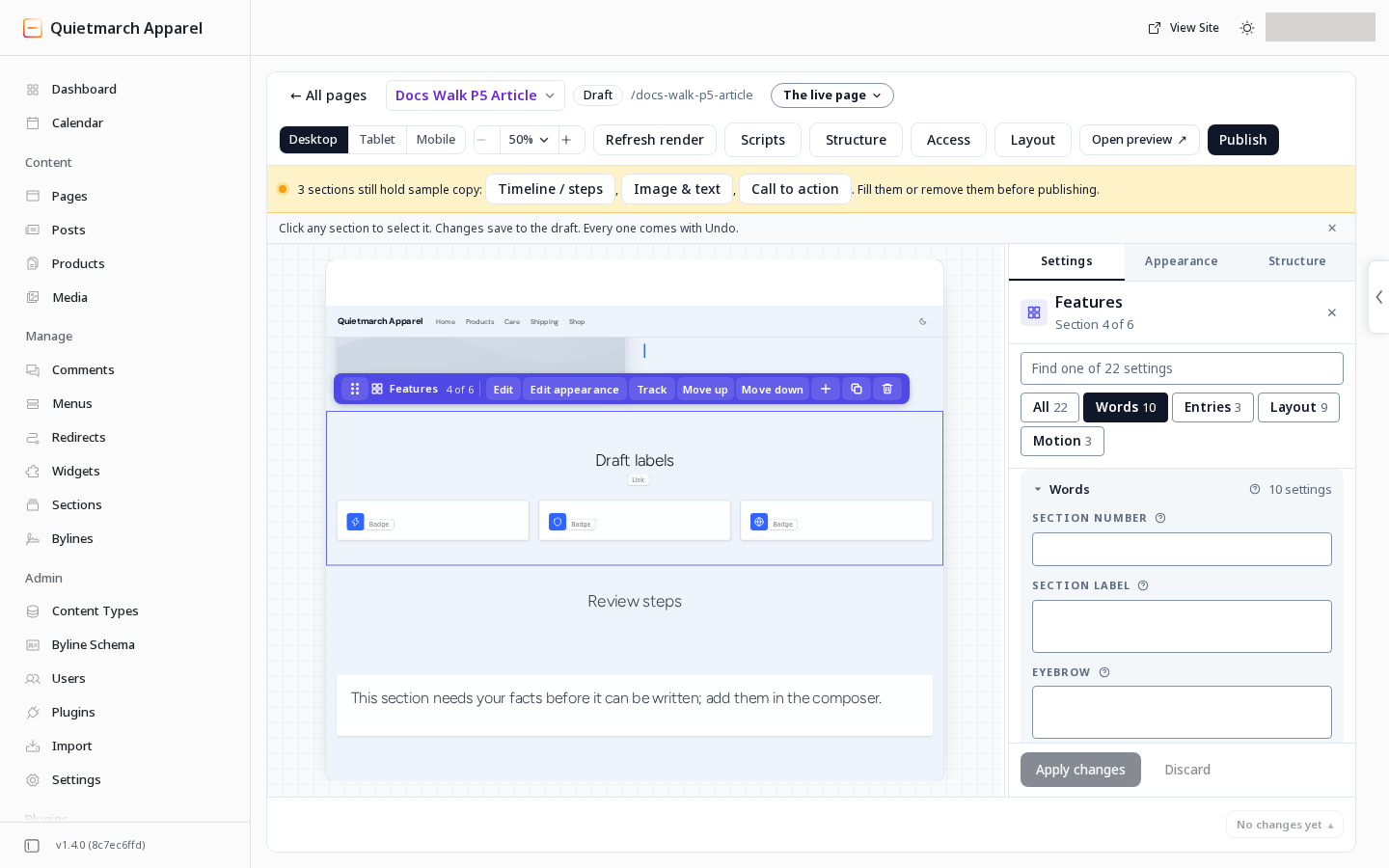
Find the right controls
Section titled “Find the right controls”- Open your page in the Composer.
- Select the section you want to change.
- Open Settings.
- Search its fields if you need to find a control.
Words, entries and layout choices appear in their own groups.
For section fields, choose Apply changes and read the draft result and its Undo. The page’s Layout button works separately: choosing a layout saves it to the draft straight away.
A starter or an existing page may already have choices saved. The defaults below describe an unset choice. The layout styles reference table gives the complete values and section lists.
On a library theme or a site that was not migrated, long section headings and button labels can wrap within narrow columns. A wide rich text table can scroll inside its own box. Check Open preview, or Preview draft on a published page, with your own words at phone width.
Choose how a heading wraps
Section titled “Choose how a heading wraps”Select a section heading, card title or group title, then open Heading wrap in its styling controls. Automatic leaves line breaks to the browser. Balanced asks for even lines; Pretty asks the browser to avoid a lone word on the last line. Apply the choice to that heading and check the preview.
This is your choice for that heading, rather than a theme role. It applies across screen sizes and states. A browser without support keeps its normal wrapping.
Choose how many steps share a row
Section titled “Choose how many steps share a row”For Timeline / steps, set Layout to Numbered steps in section Settings, then choose Steps per row. Automatic fits the available width; 2 per row, 3 per row and 4 per row choose equal columns on wide screens. Tablets and phones still wrap to fit. Apply the section change to save it to the draft.
Add a section label
Section titled “Add a section label”In Settings, open Words.
- Fill Section number with your own words if you want a number.
- Fill Section label with your own words if you want a label.
Either can stand alone. Both start empty.
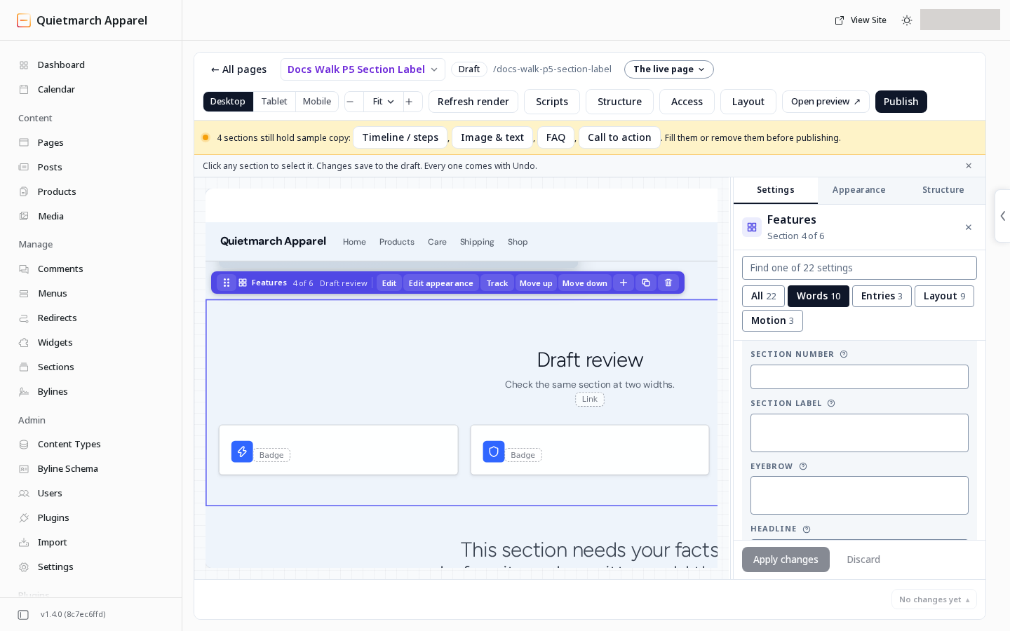
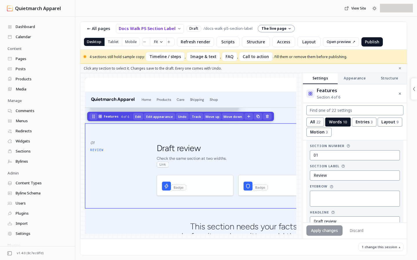
On a wide screen the label stands in a narrow column beside the section’s heading and body. The label uses capitals and the theme’s monospace font, whose characters have equal width. The number stands above it in italic heading type. Below 1024 pixels, they move to one line above the heading.
On a site that was not migrated, the label keeps its start edge even when the section’s words are centred.
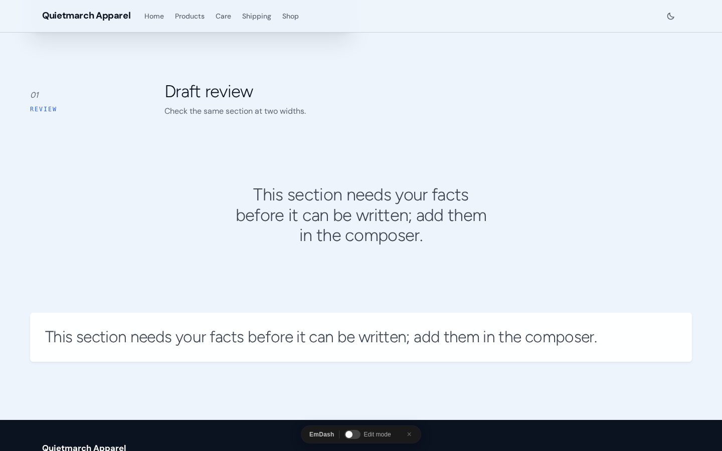
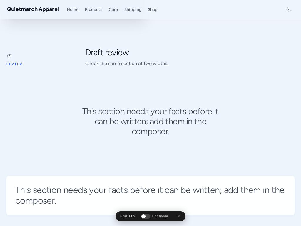
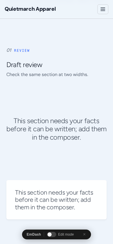
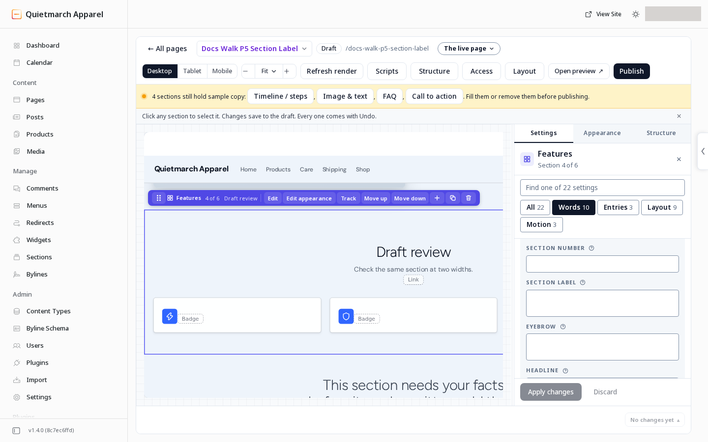
These fields are offered on Hero, Features, Testimonials, Gallery, Video, Pricing, FAQ, Call to action, Rich text, Form, Stats, Logo cloud, Image & text, Footer CTA, Team, Timeline / steps, Comparison table, Newsletter signup, Blog teaser, Layout, Recommendations, Live list and Services.
Choose a Stage band
Section titled “Choose a Stage band”On Footer CTA and Banner, the field is named Tone. On the other supported types, use Band tone.
- In Settings, open Layout.
- Open Band tone, or Tone on Footer CTA and Banner.
- Choose Stage (near black, with glow).
Stage draws a dark background, a soft glow and light text. Buttons and cards use the theme’s Stage colours. It is offered on Hero, Features, Testimonials, Pricing, Call to action, Stats, Image & text, Footer CTA, Banner and Layout.
Stage is never chosen by an empty field. The usual default remains: page background for most types, Subtle surface (default) for Testimonials, Style default for Call to action, Primary band for Footer CTA and Accent for Banner.
To change Stage colours across the site:
- Open Site.
- Open Catalogs.
- Open Themes.
- Choose Edit for the intended theme.
- Open Colors.
The Stage band group offers Stage ground, Stage card, Stage line, Stage text, Stage muted, Stage heading, Stage accent, Stage accent text and Stage glow. Empty rows use the theme’s derived colours. Review the theme preview before saving or activating a theme.
Put a picture beside the words
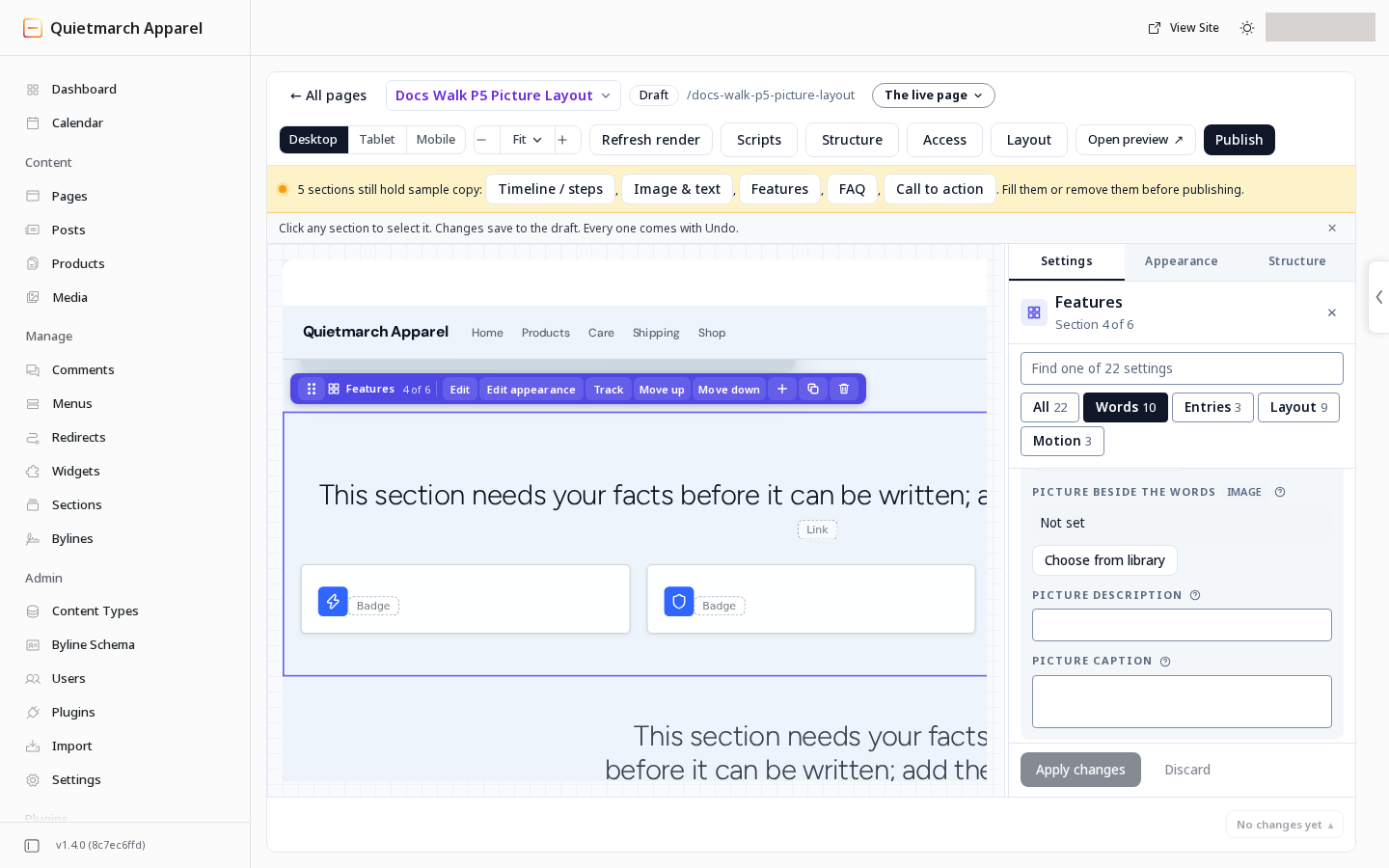
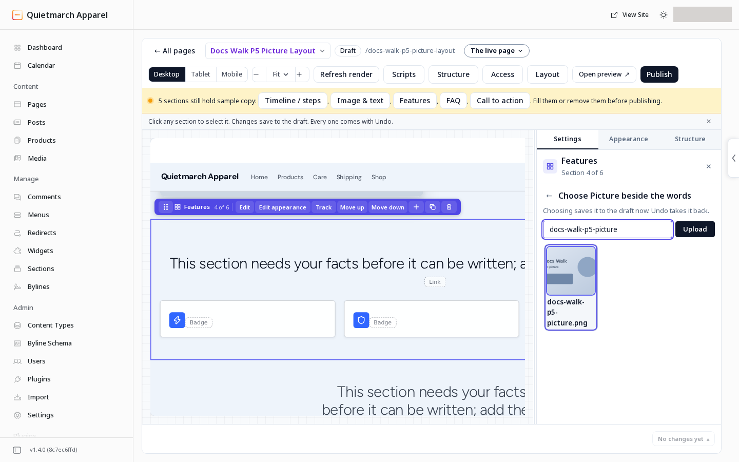
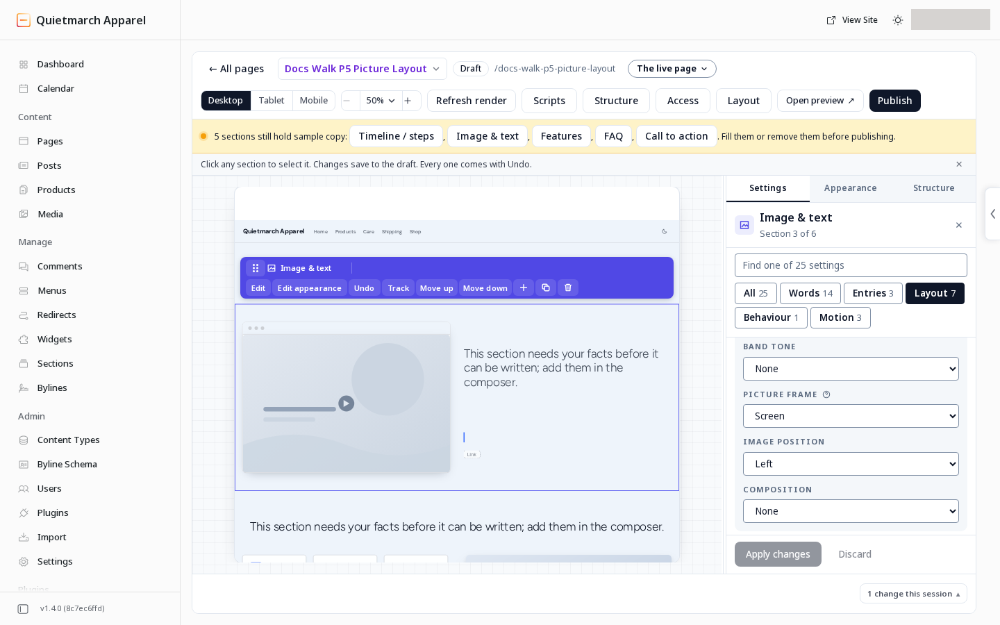
Section titled “Put a picture beside the words”On a supported section, choose Picture beside the words from your media library. The empty default keeps the section’s usual layout.
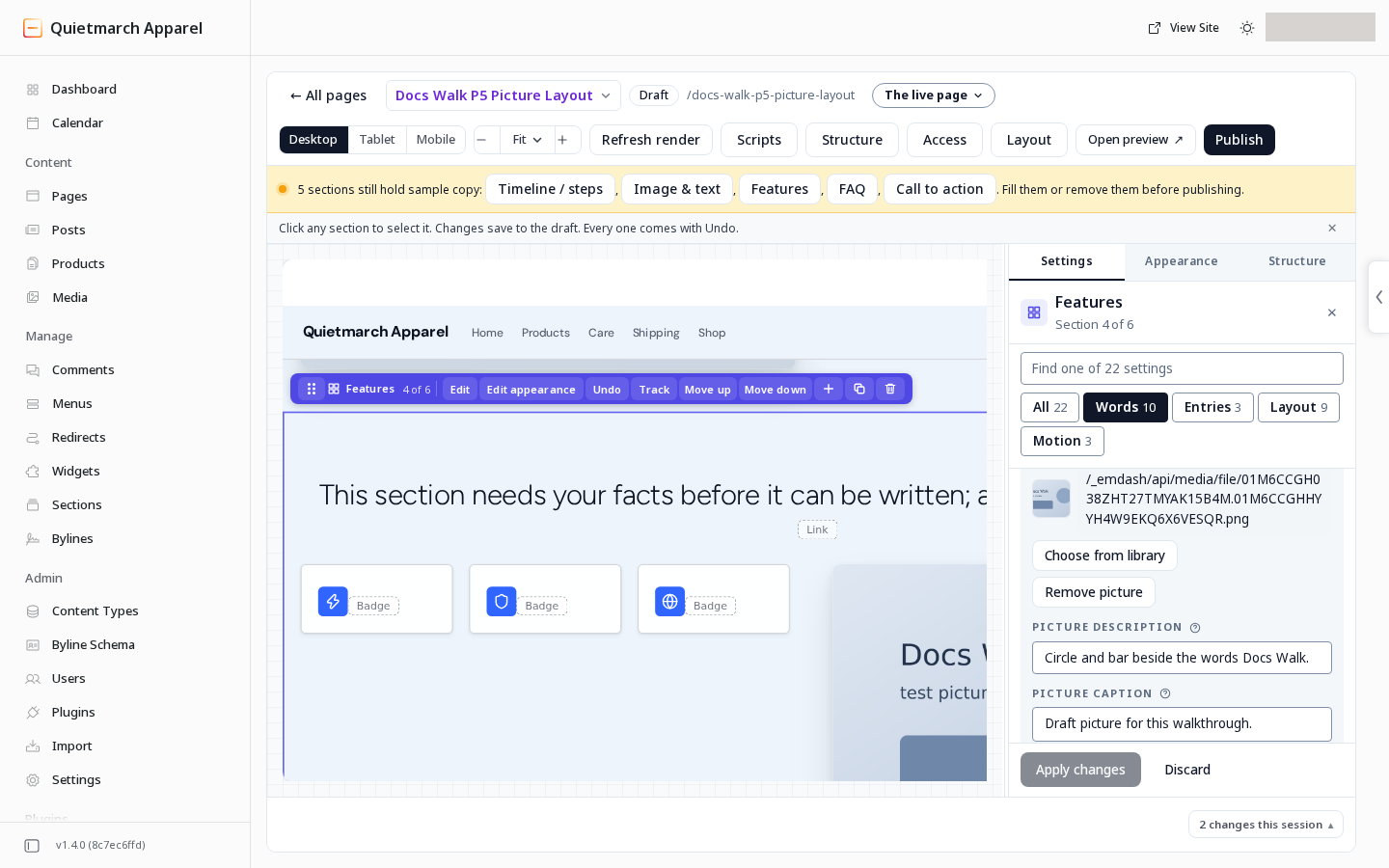
| Field | What to choose | Default |
|---|---|---|
| Picture description (alt text) | Describe what the picture conveys, within the stated 500 character limit. Leave it empty for a decorative picture. | Empty |
| Picture caption | A line under the picture. | Empty |
| Picture side | Right or Left. | Right |
| Picture frame | None, Screen, Dark stage or Light. | None |
| Picture width | Even shares the row equally. Wide gives the picture more room. Narrow makes a slim picture column. | Even |
| Heading place | Above both columns, or Beside the picture, over the words. | Above both columns |
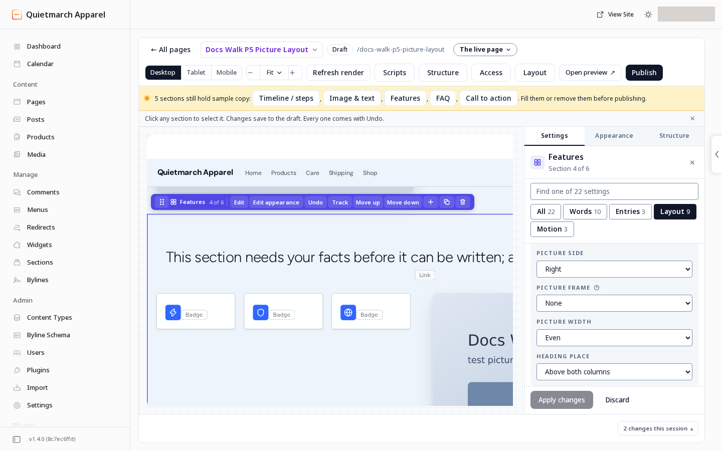
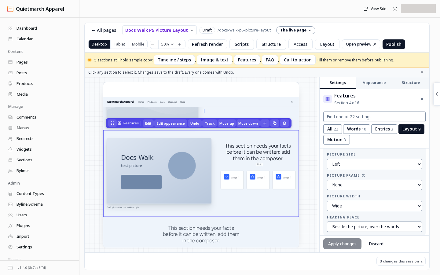
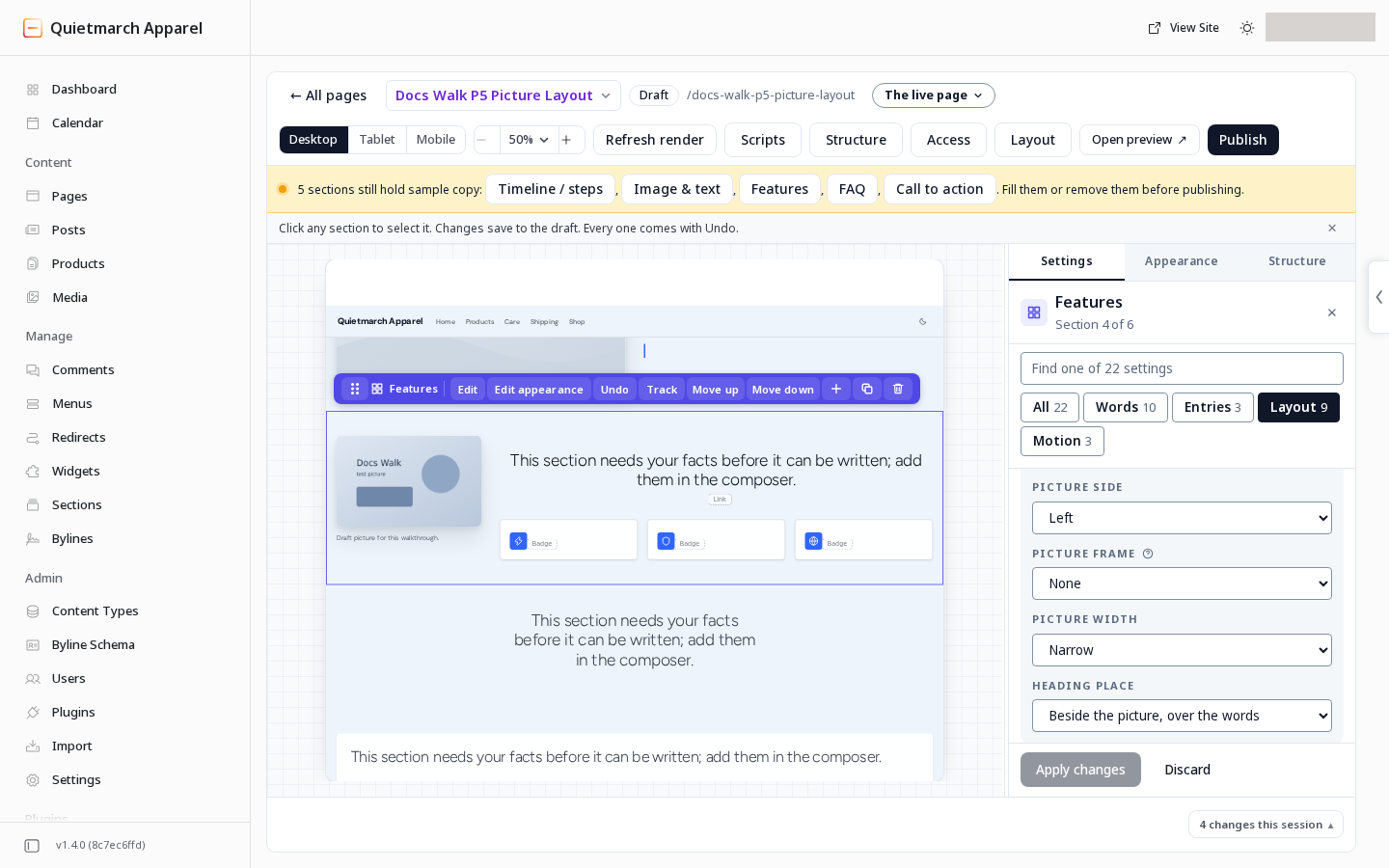
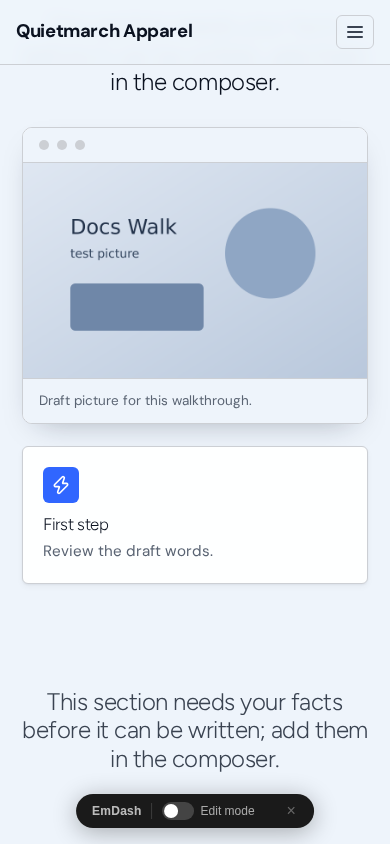
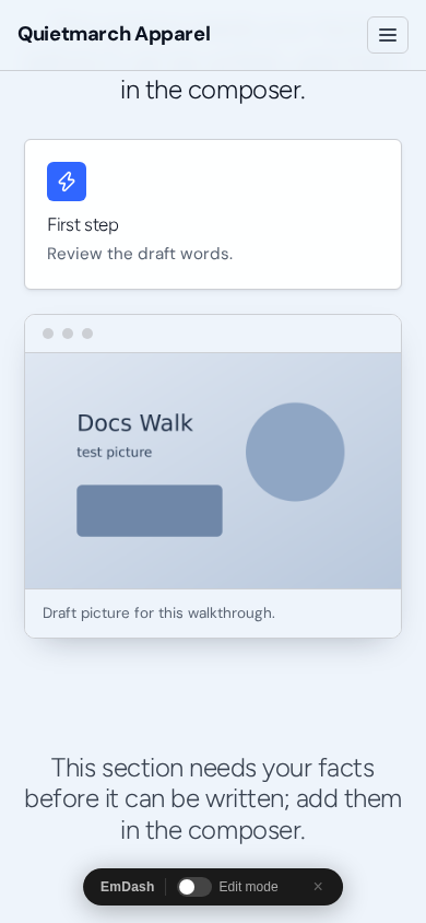
Screen adds a window bar with three dots, a border and a shadow. Dark stage puts the picture on a dark panel with a glow. Light adds a thin border and soft shadow. None adds no frame.
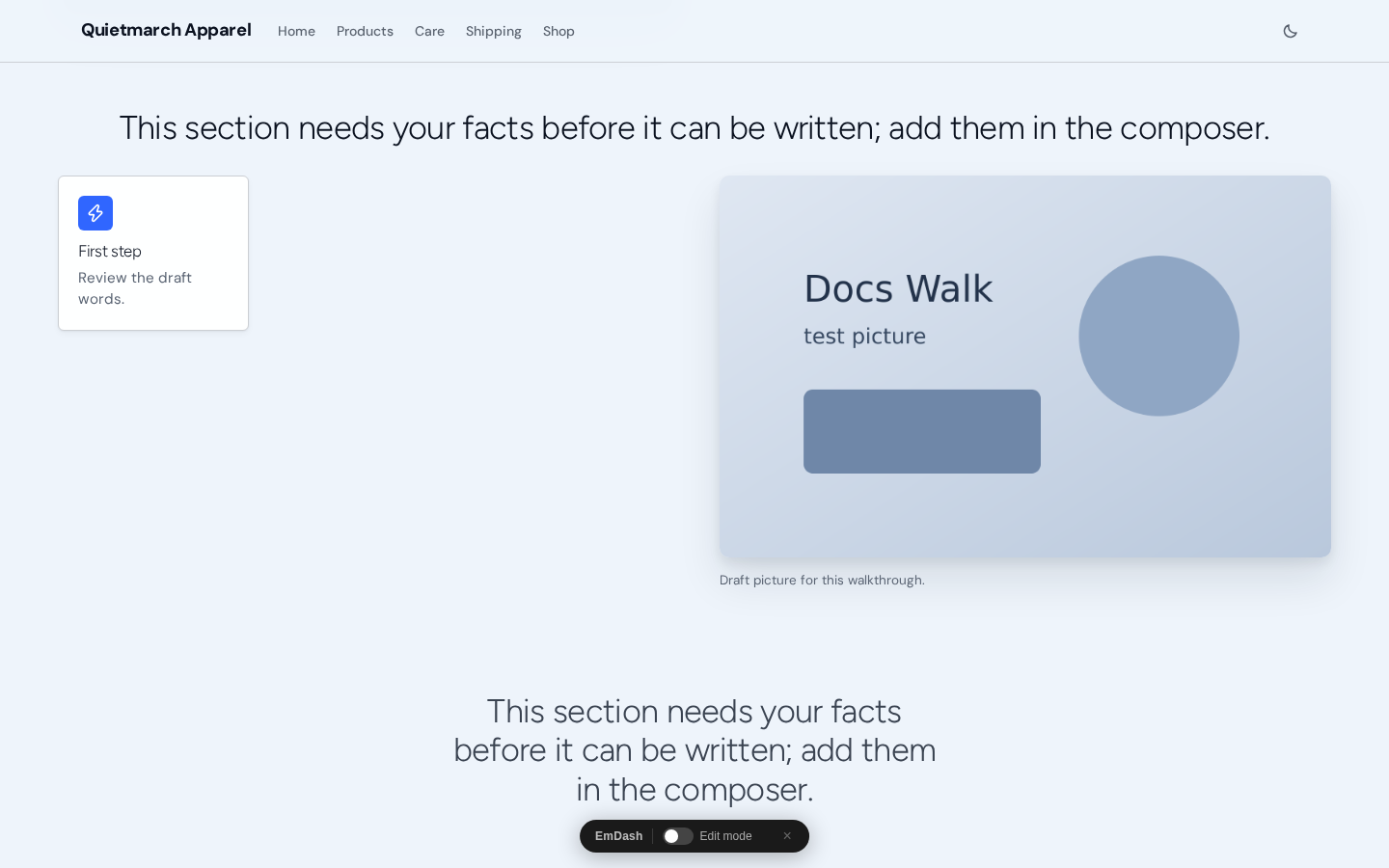
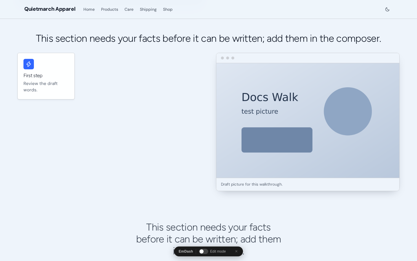
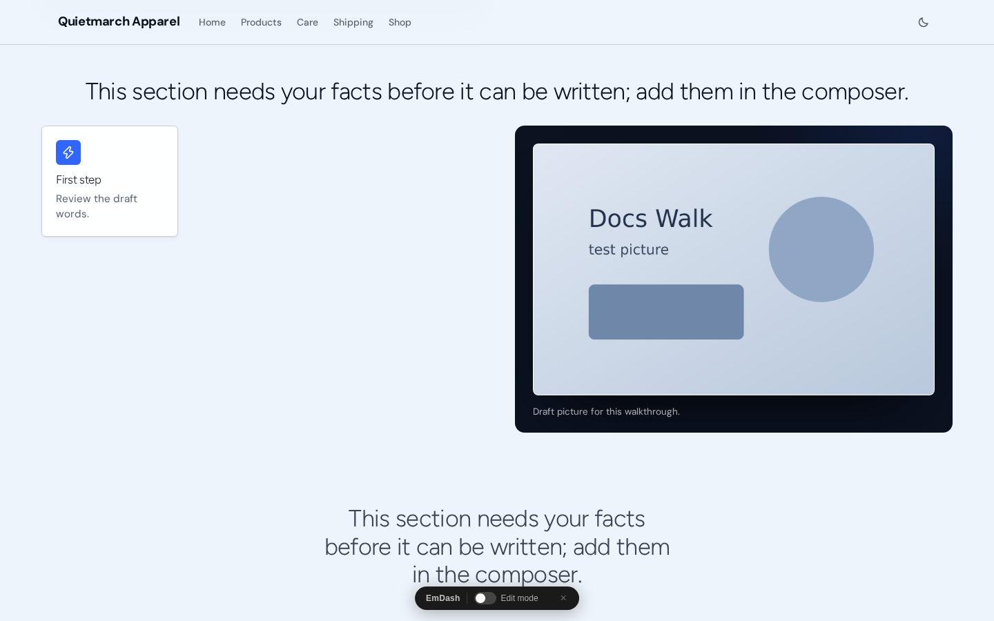
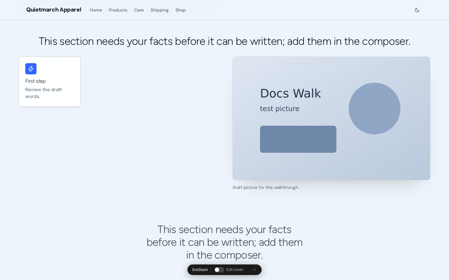
The full group is offered on Features, Testimonials, Pricing, FAQ, Rich text, Stats, Logo cloud, Footer CTA, Team, Timeline / steps, Comparison table, Newsletter signup, Blog teaser, Recommendations and Live list.
Image & text has its own picture controls and also offers Picture frame. Use those existing controls for its picture. The full picture group above is a separate choice on the listed types.
On a phone the picture and words stack. A left picture comes before the words; a right picture follows them. Check Open preview at the widths your readers use.
Add rules to a Hero
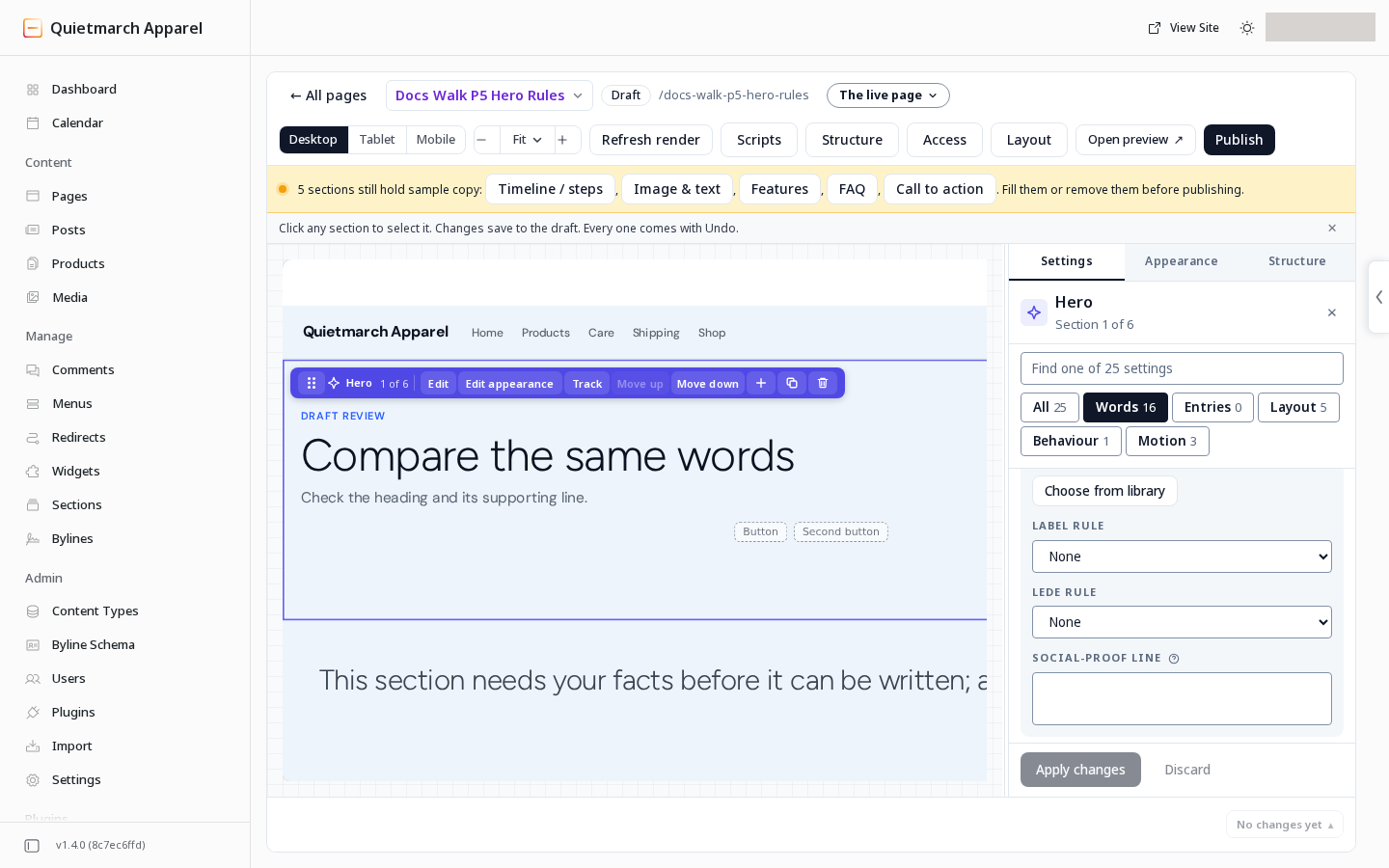
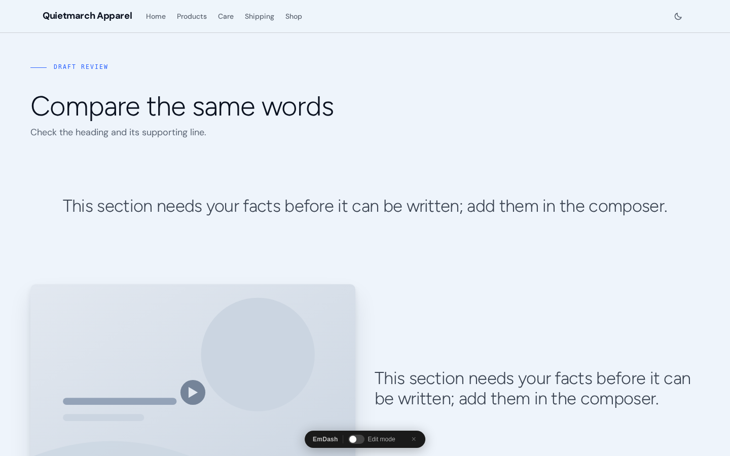
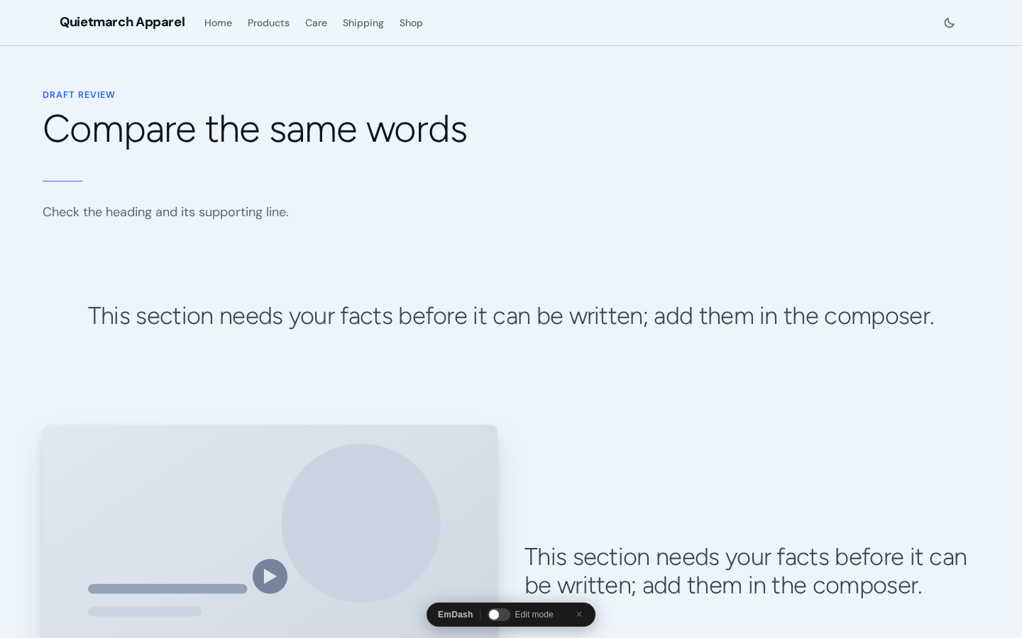
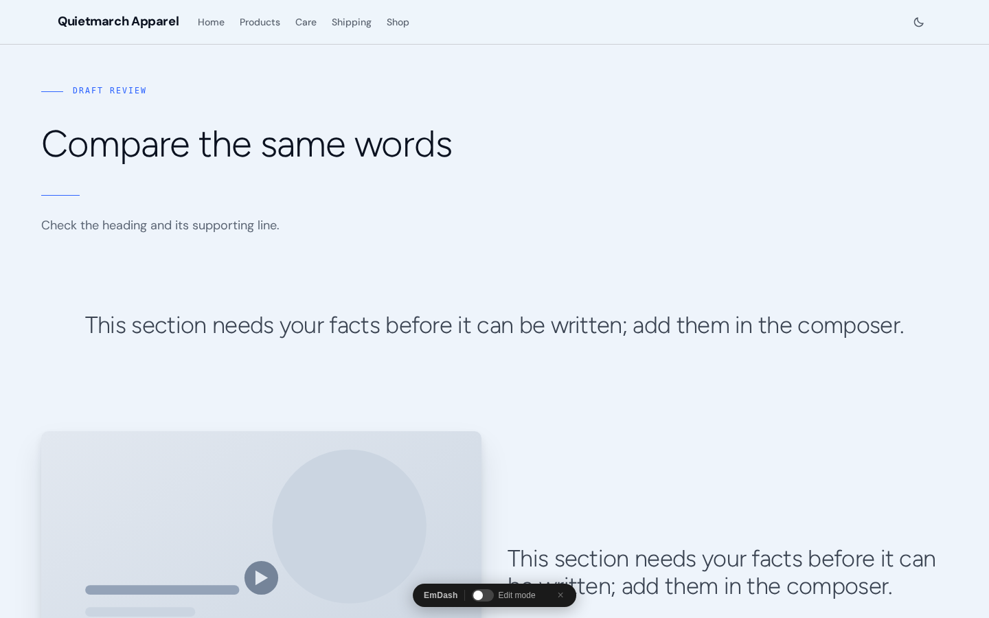
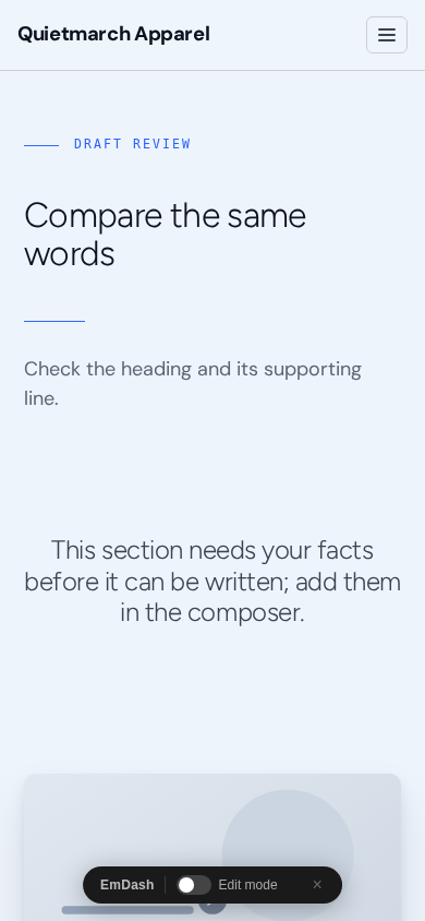
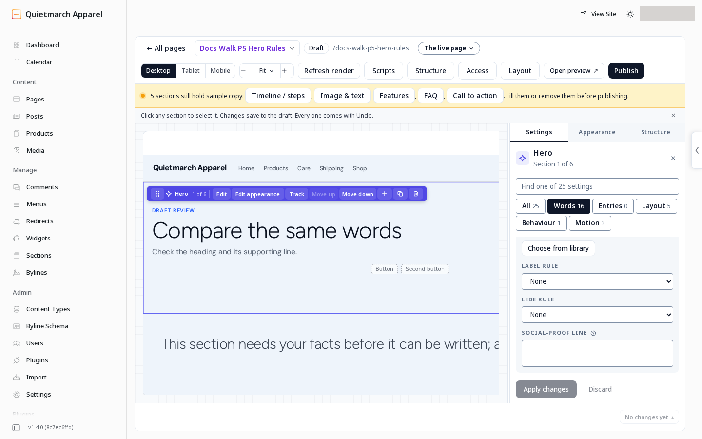
Section titled “Add rules to a Hero”A Hero created from the catalog offers two choices in Settings:
| Field | Choice that draws the rule | Default |
|---|---|---|
| Label rule | A short rule before the label | None |
| Lede rule | A rule between the headline and the subheadline | None |
The label rule needs the Hero’s Eyebrow words. The lede rule needs its Subheadline. A Hero that keeps an imported design keeps that design’s own structure.
Make an index of links
Section titled “Make an index of links”On Features, open Index list in the entries. An empty list keeps the section’s normal cards.
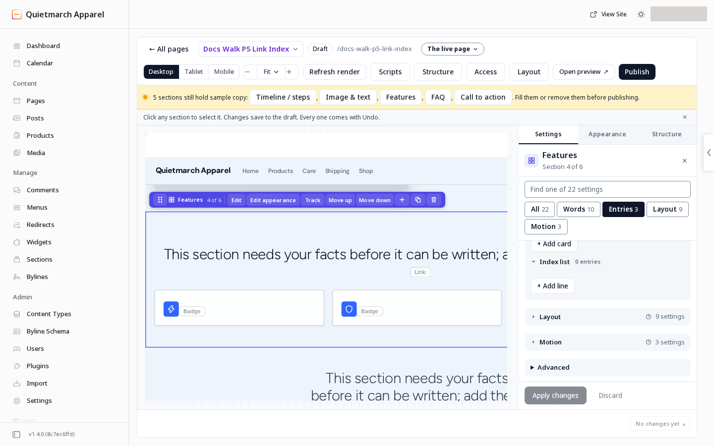
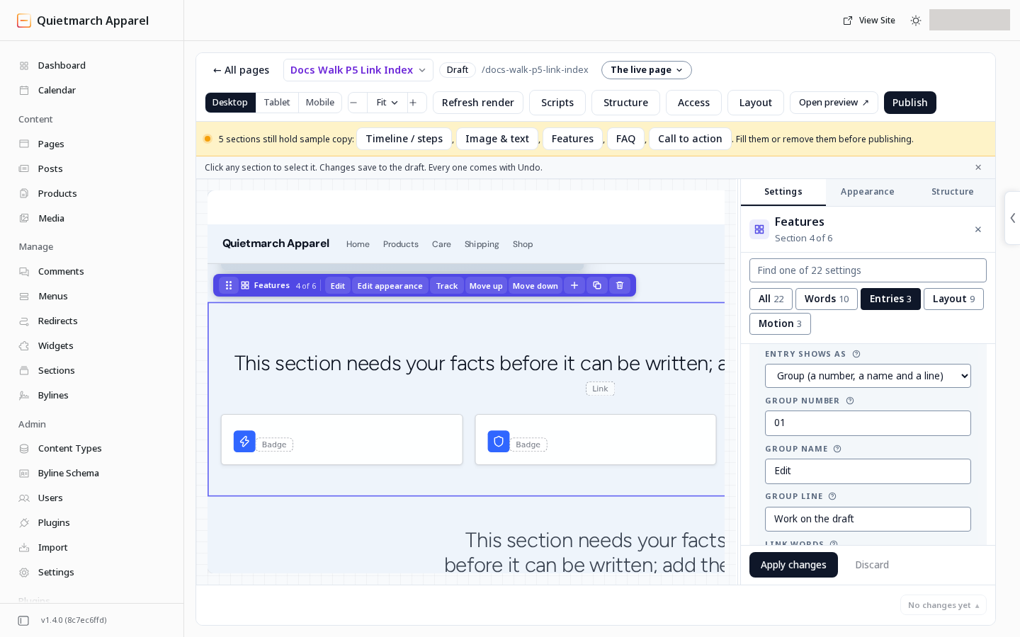
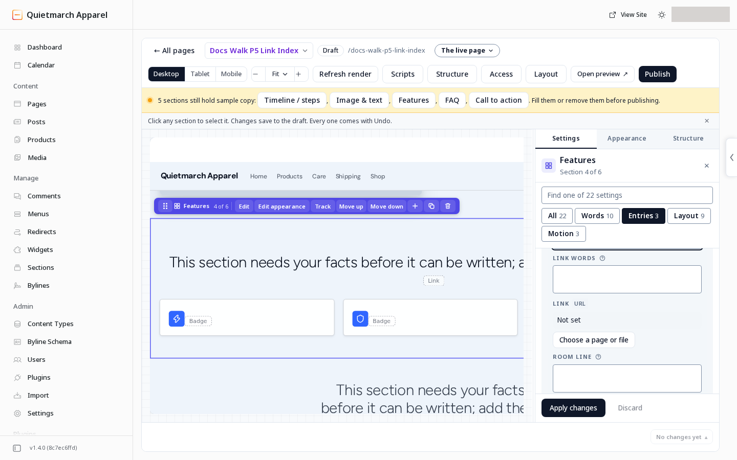
For each entry, Entry shows as chooses Group (a number, a name and a line) or Link row (one link under the group above). An unset entry is read as a group.
For a group:
- Fill Group number.
- Fill Group name.
- Fill Group line.
For each link row:
- Fill Link words.
- Set its destination in Link.
- Fill Room line.
These fields start empty. Each link belongs to the group above it. A link before the first group still draws, without a group heading.
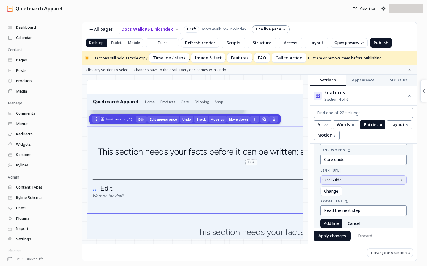
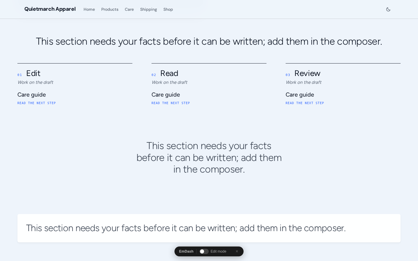
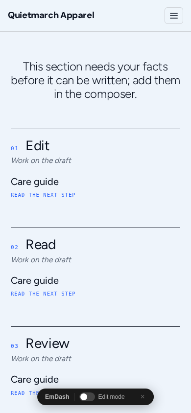
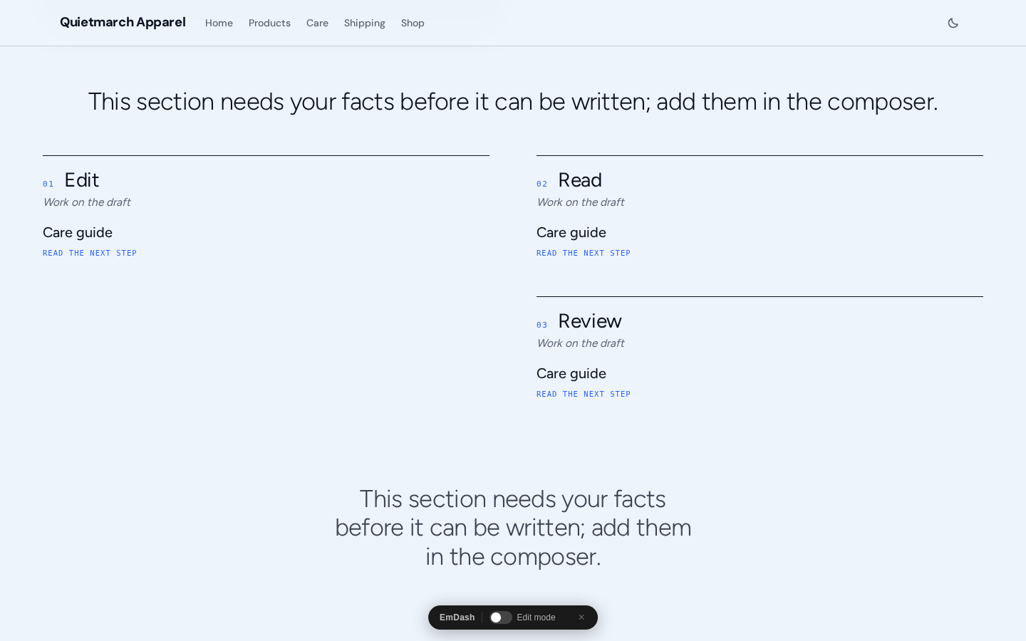
The index draws ruled link rows in the section’s Columns, whose choices are 2, 3 and 4. The normal starter uses three columns. Groups stay together. On a phone they form one column in the order you wrote them.
Draw facts as ruled rows
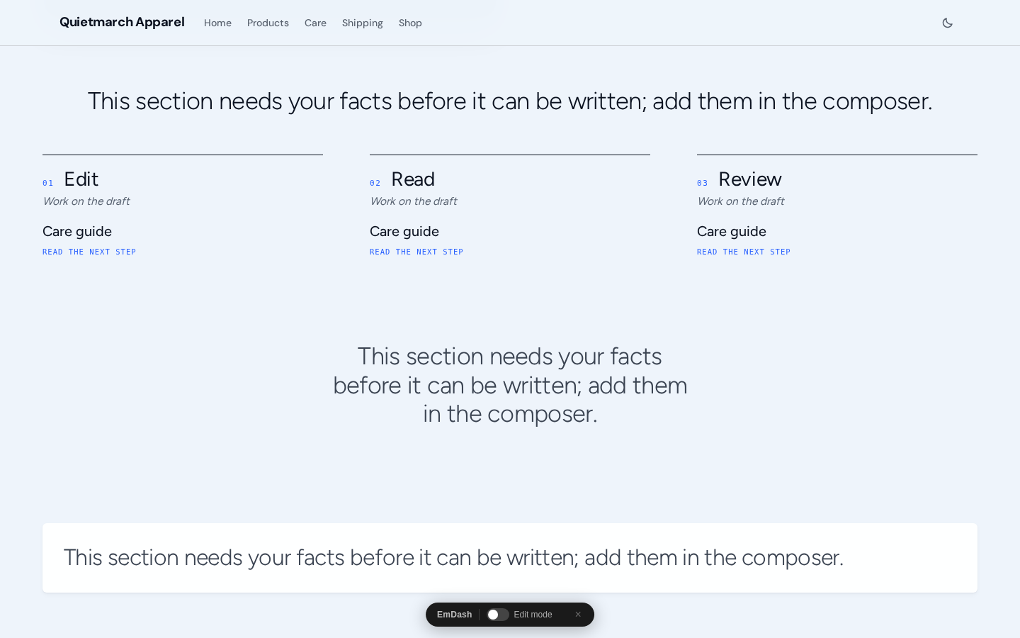
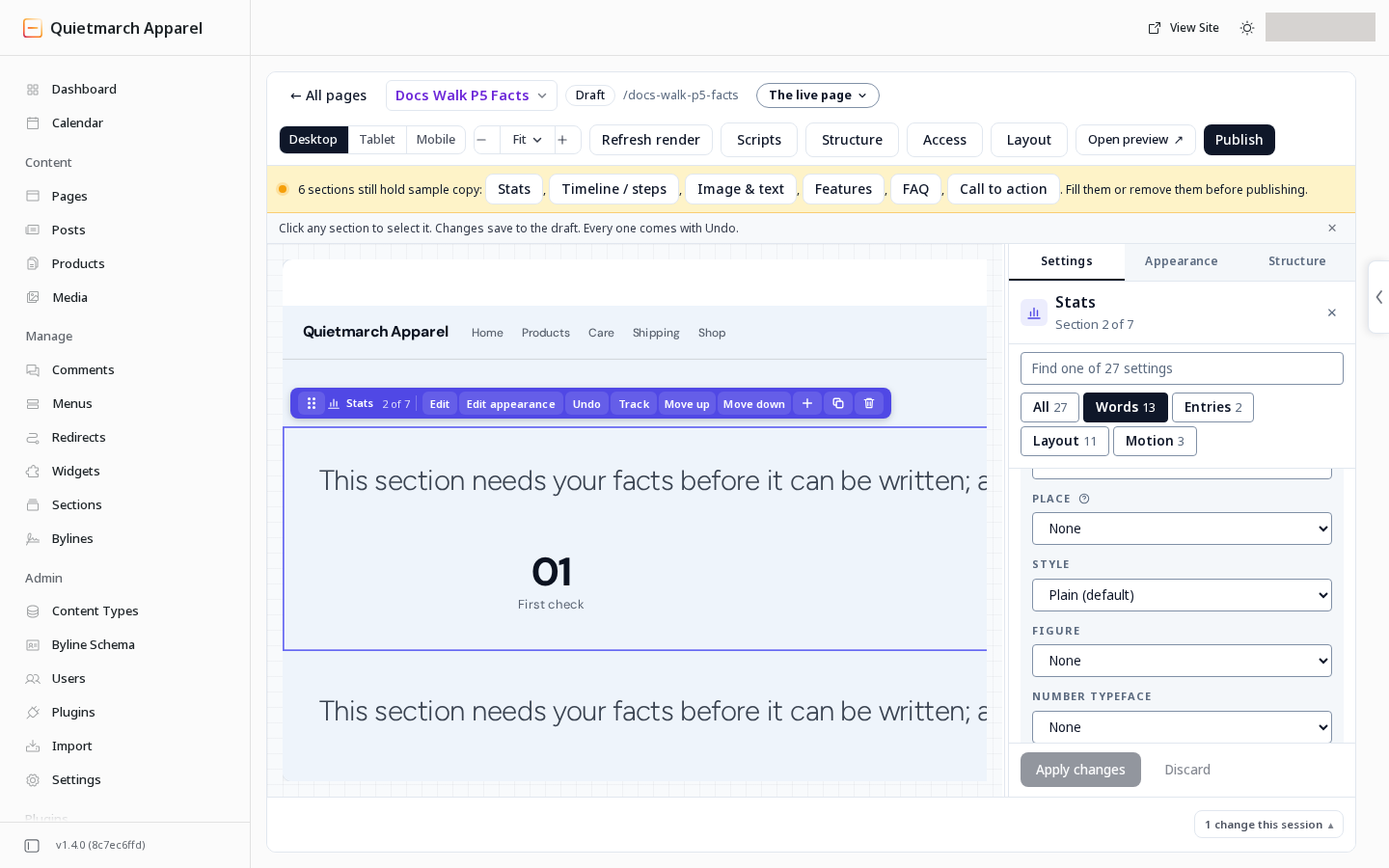
Section titled “Draw facts as ruled rows”On Stats:
- Open Layout.
- Choose Facts list.
Each fact’s label comes first and its value stands beside it. Other Layout choices remain Centered (default), Heading left, numbers right and Compact proof strip.
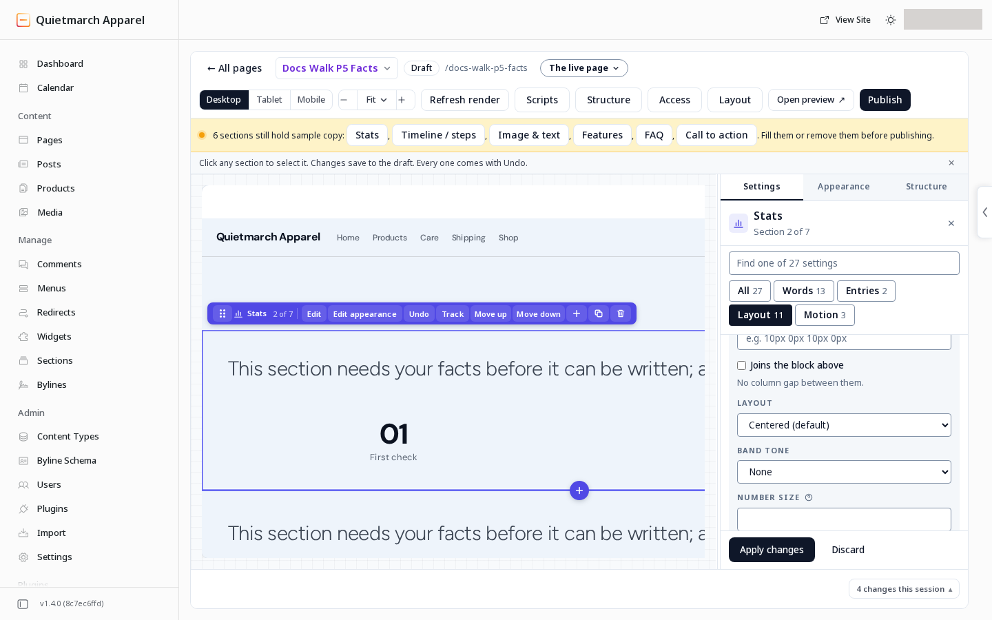
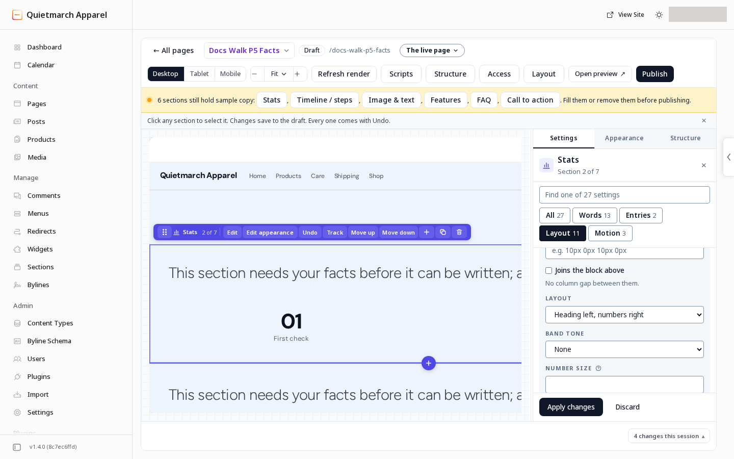
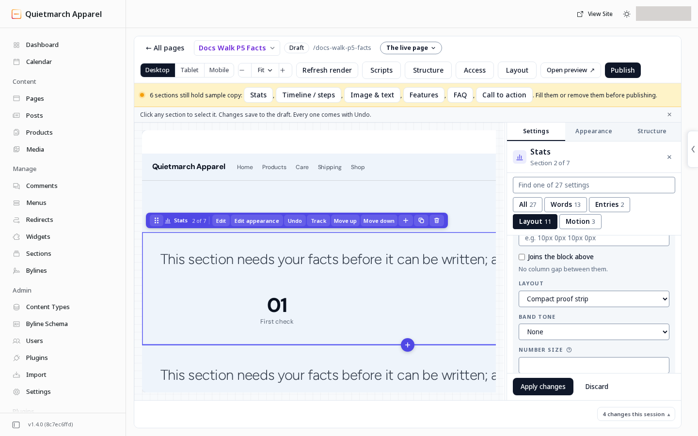
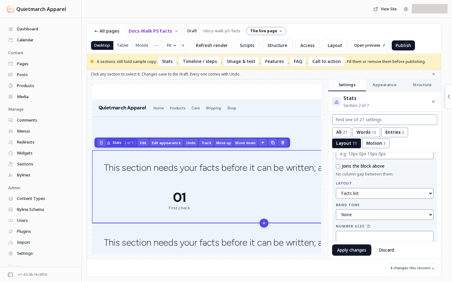
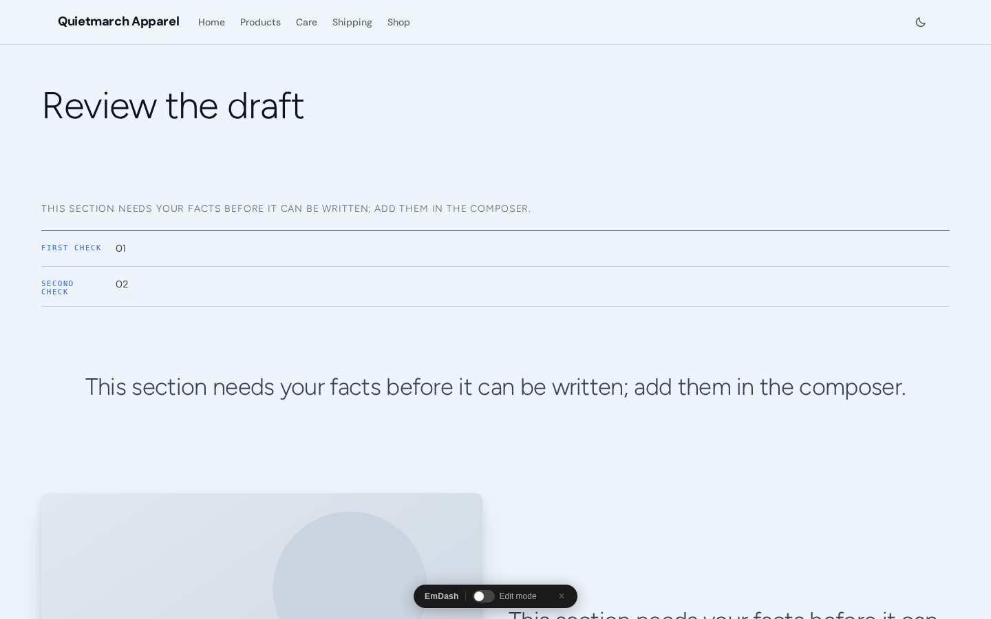
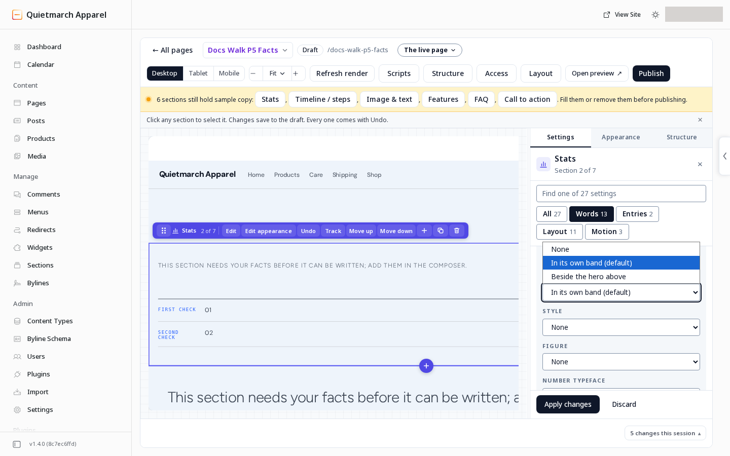
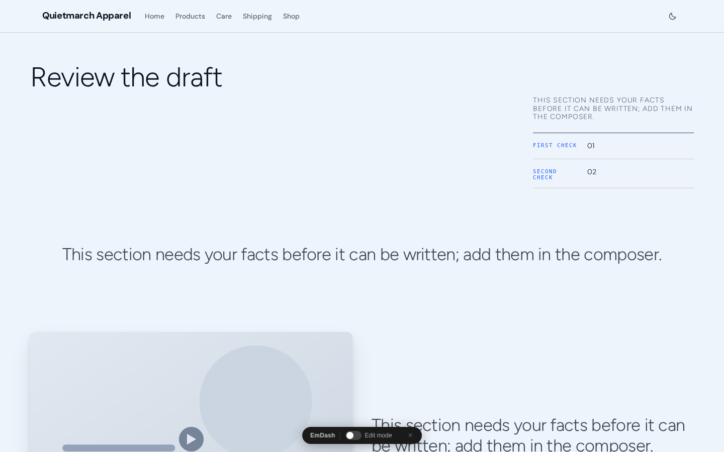
Place appears for a Facts list. Its default is In its own band (default). Choose Beside the hero above to place it with the Hero immediately before it.
For a Hero created from the catalog, with Left layout and no picture, the facts sit beside the Hero’s words on a wide screen. They move underneath on narrower screens. A centered Hero or a Hero with a picture keeps the facts under its words. Without a suitable preceding Hero, the facts stay in their own band. The facts stay separate when part of the page is withheld, or when the Hero or Stats section is a slot whose content is selected for the visitor.
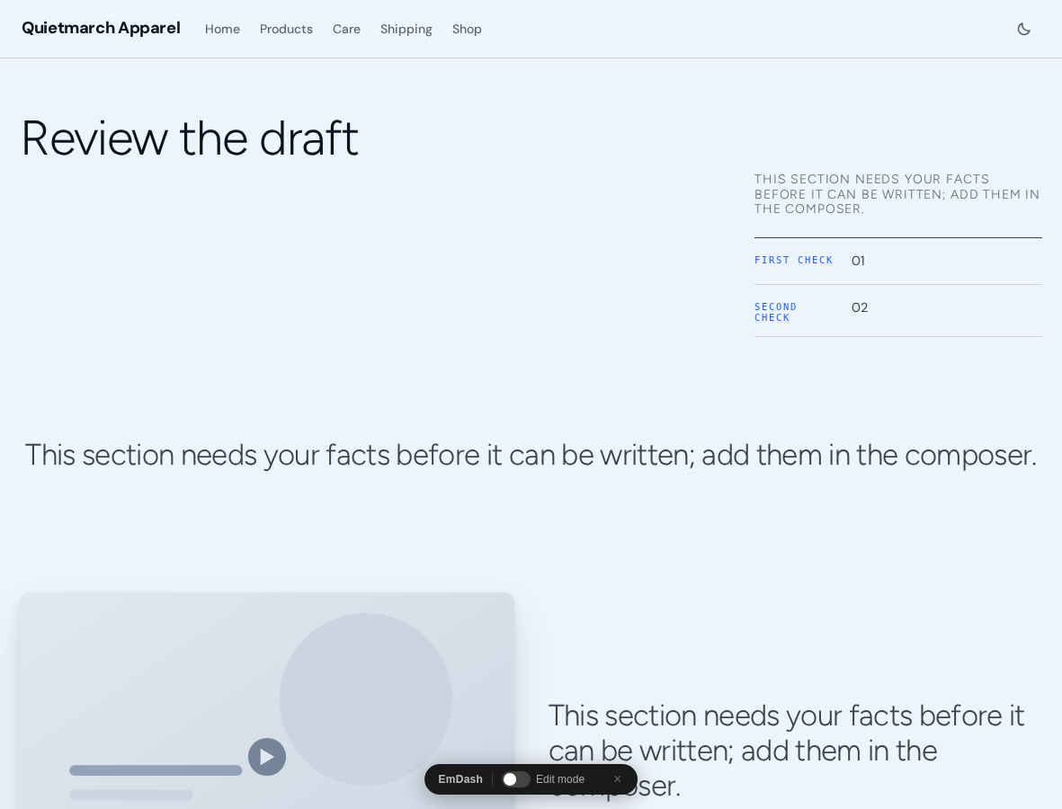
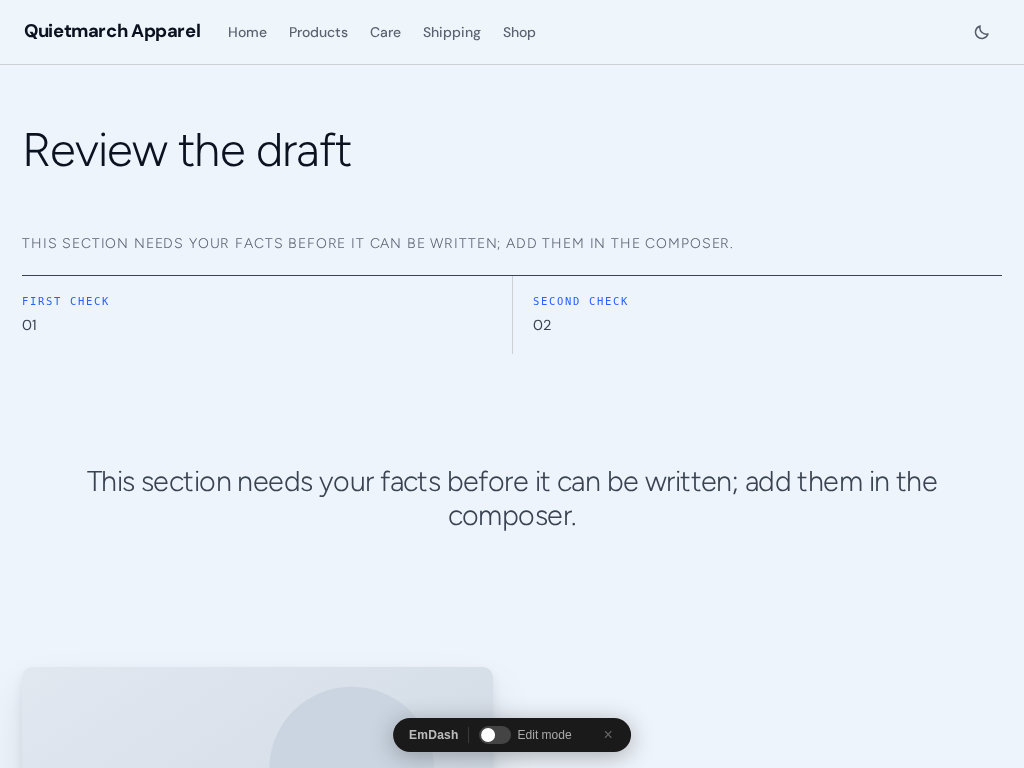
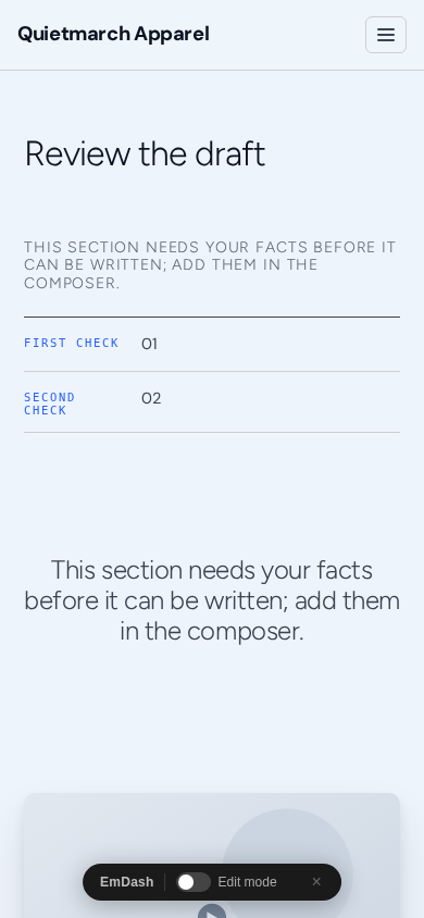
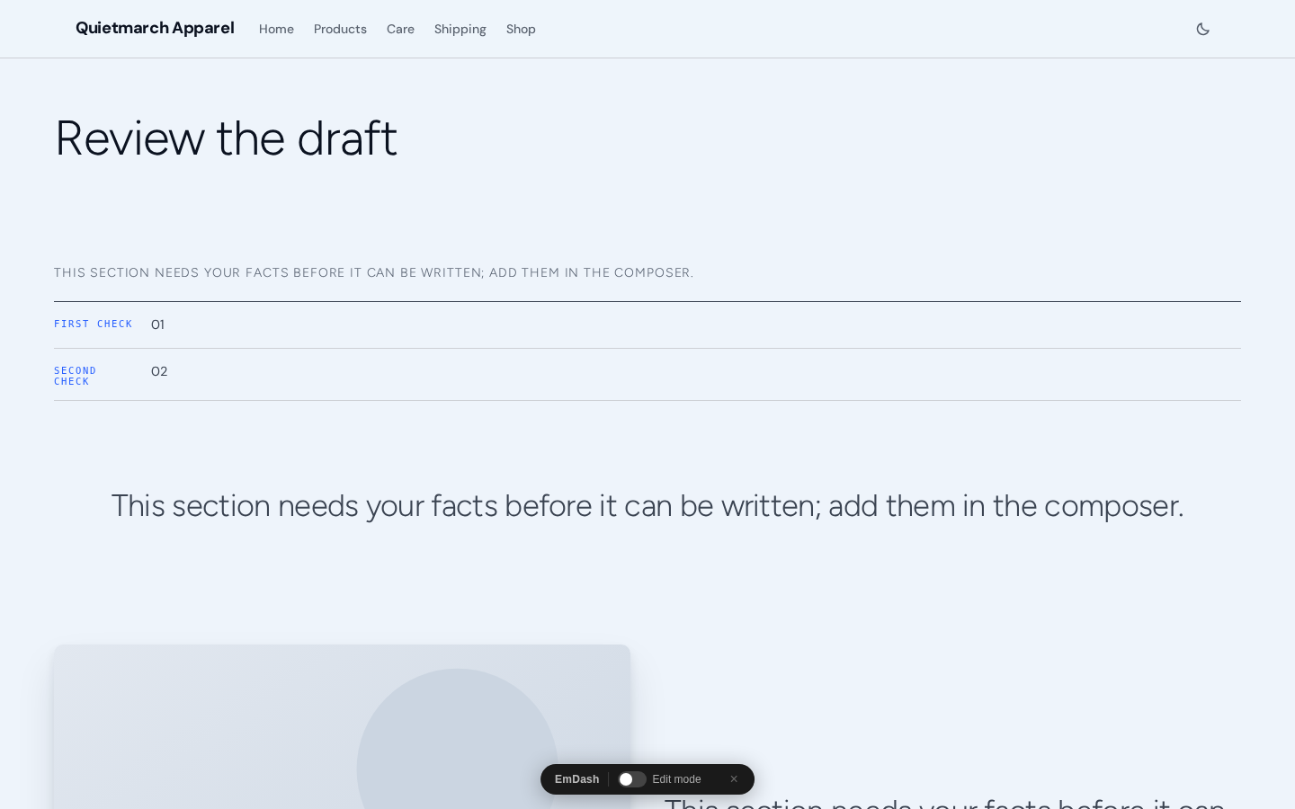
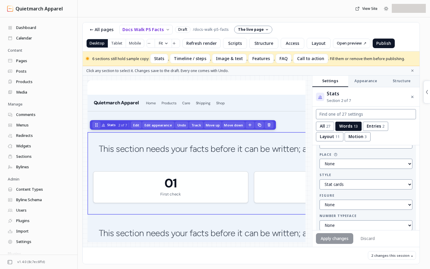
For the other Stats layouts, Style offers Plain (default) or Stat cards. A Facts list uses its ruled rows.
Give an article a side rail
Section titled “Give an article a side rail”-
Open the page’s Layout button.
-
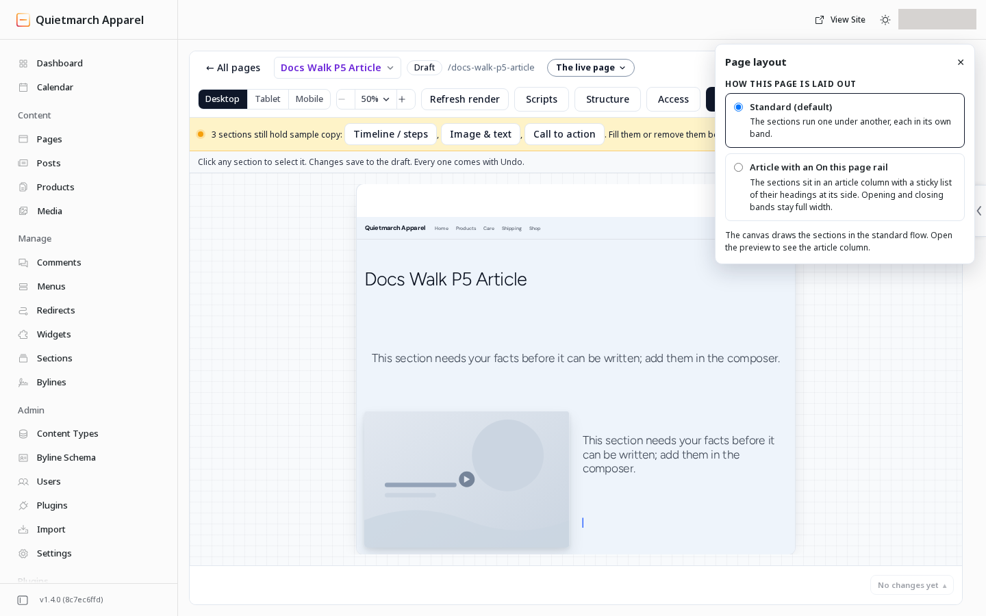
In Page layout, choose Article with an On this page rail. The other choice, Standard (default), keeps the normal sequence of sections.
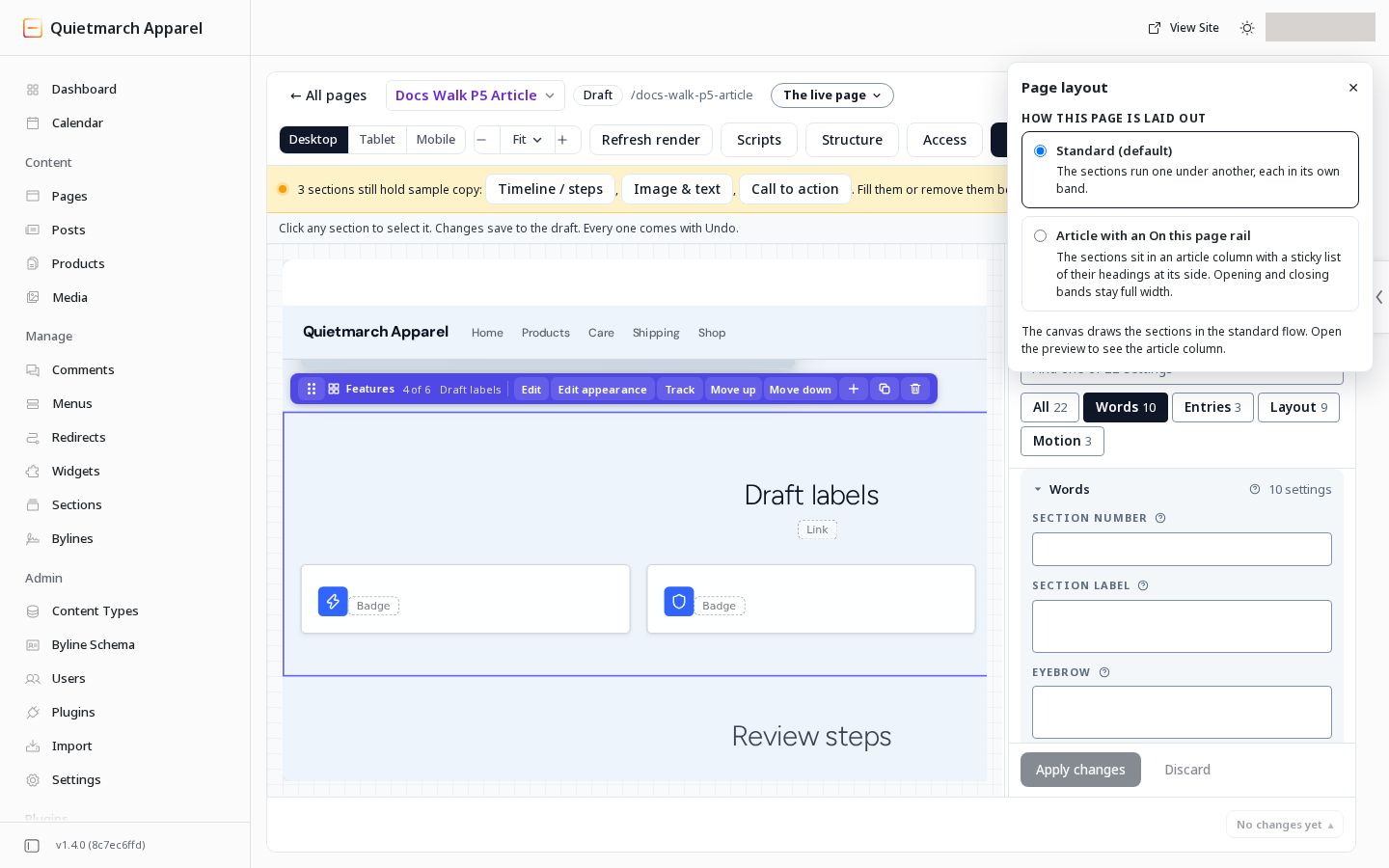
Standard keeps the usual sequence of sections. -
Read the draft receipt. Use its Undo to put the earlier layout back.
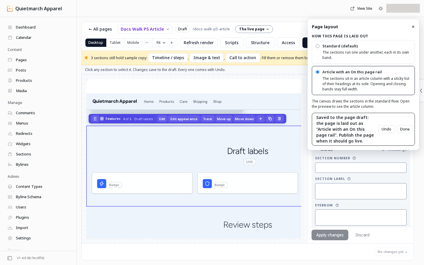
A page layout choice saves straight to the draft. -
Open Open preview to see the article column and rail. The Composer canvas keeps the standard section flow.
Use Open preview to see the article rail. 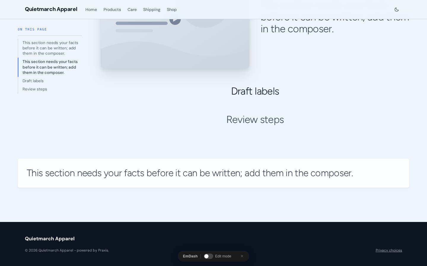
The rail links come from the article’s own section headings. 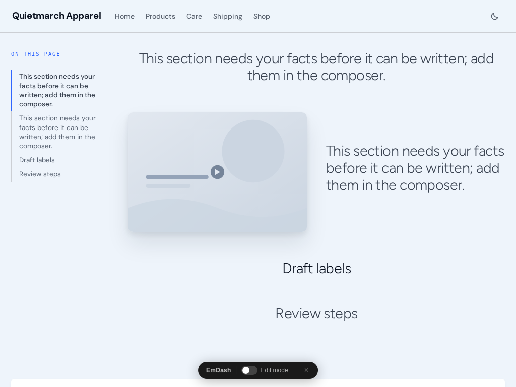
Check the article at an intermediate width as well as on a phone. 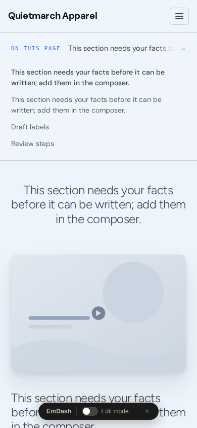
On a phone the heading links move into a compact list.
The rail uses the article sections’ headline words. Rich text can contribute the first heading in its body. A section with no heading adds no rail entry. An HTML anchor you set under Advanced is the named point its link jumps to; otherwise the page makes an anchor from the heading.
Opening Hero, Banner and Gallery sections and closing Footer CTA, Call to action and Banner sections keep their full width. On a narrow screen the rail becomes a compact On this page list above the article.
An imported page that keeps its WordPress layout and sidebar does not offer this page layout.
Open a picture at full size
Section titled “Open a picture at full size”Hero, Gallery, Call to action and Image & text offer Open full size on click under Behaviour. It is on by default. Switch it off to keep that section’s pictures from opening in the viewer.
Picture descriptions. With Open full size on click on, a picture control uses its supplied alt text as its name. Without a description, it is named “Open the picture full size”. Fill in what a meaningful picture conveys.
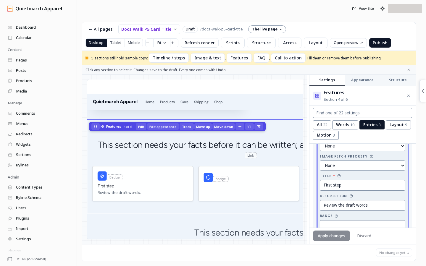
A Features card has its own Picture description (alt text) below Image. In a native card, leaving it empty uses the card title. A new description over the stated 500 character limit is refused rather than cut. Older stored descriptions keep their previous rendering.
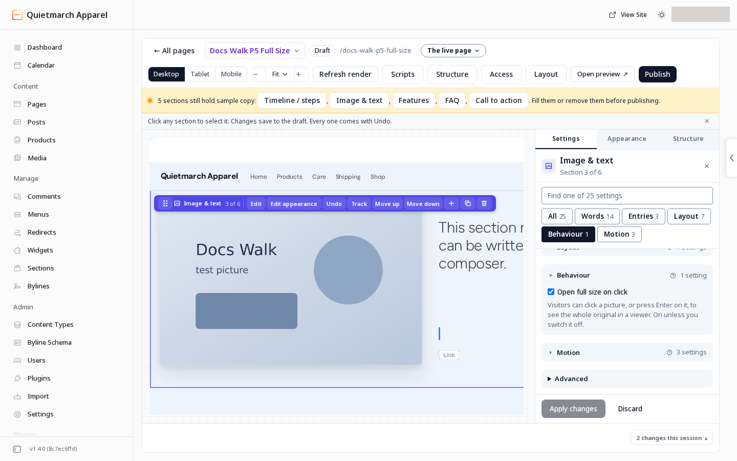
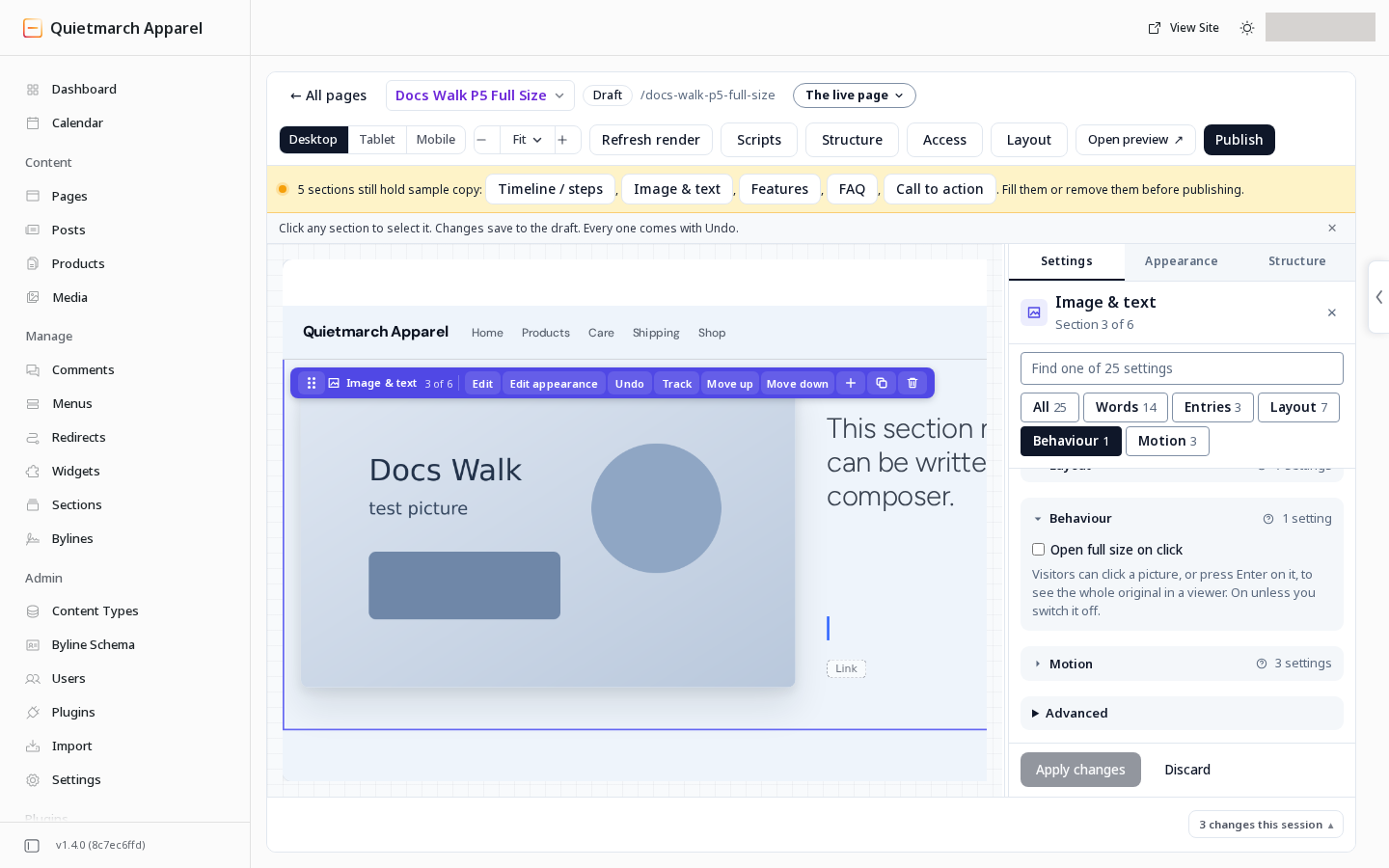
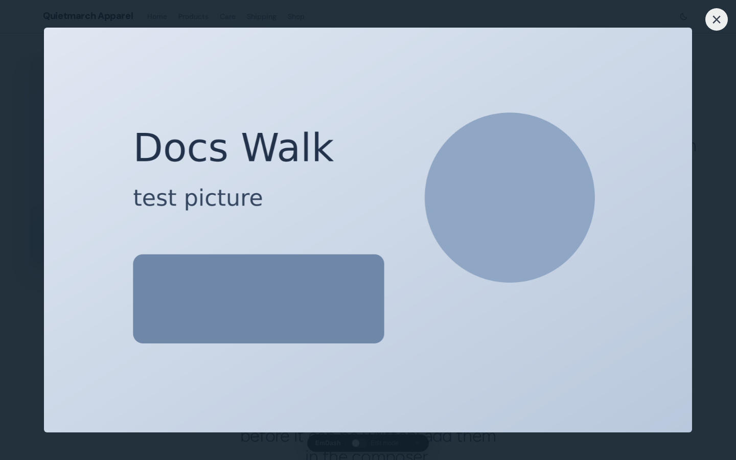
Visitors can click a picture or reach it with the keyboard and press Enter. The viewer opens its original library file. Pictures placed beside a section’s words use the same viewer. The photo viewer adjusts the exit mark (Close) and arrow icons’ colour for dark themes.
Remove an icon or a card title
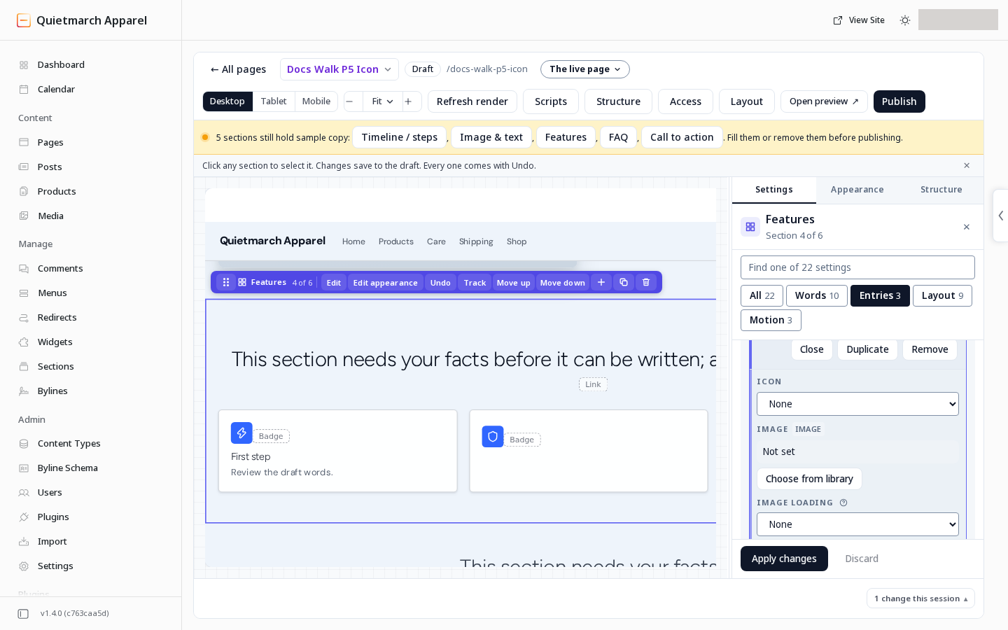
Section titled “Remove an icon or a card title”For an optional Icon in Features, Stats or a List, choose None to clear it. The catalog calls that empty choice No icon. A saved entry or starter keeps its existing icon until you change it. You can also ask the copilot for no icons.
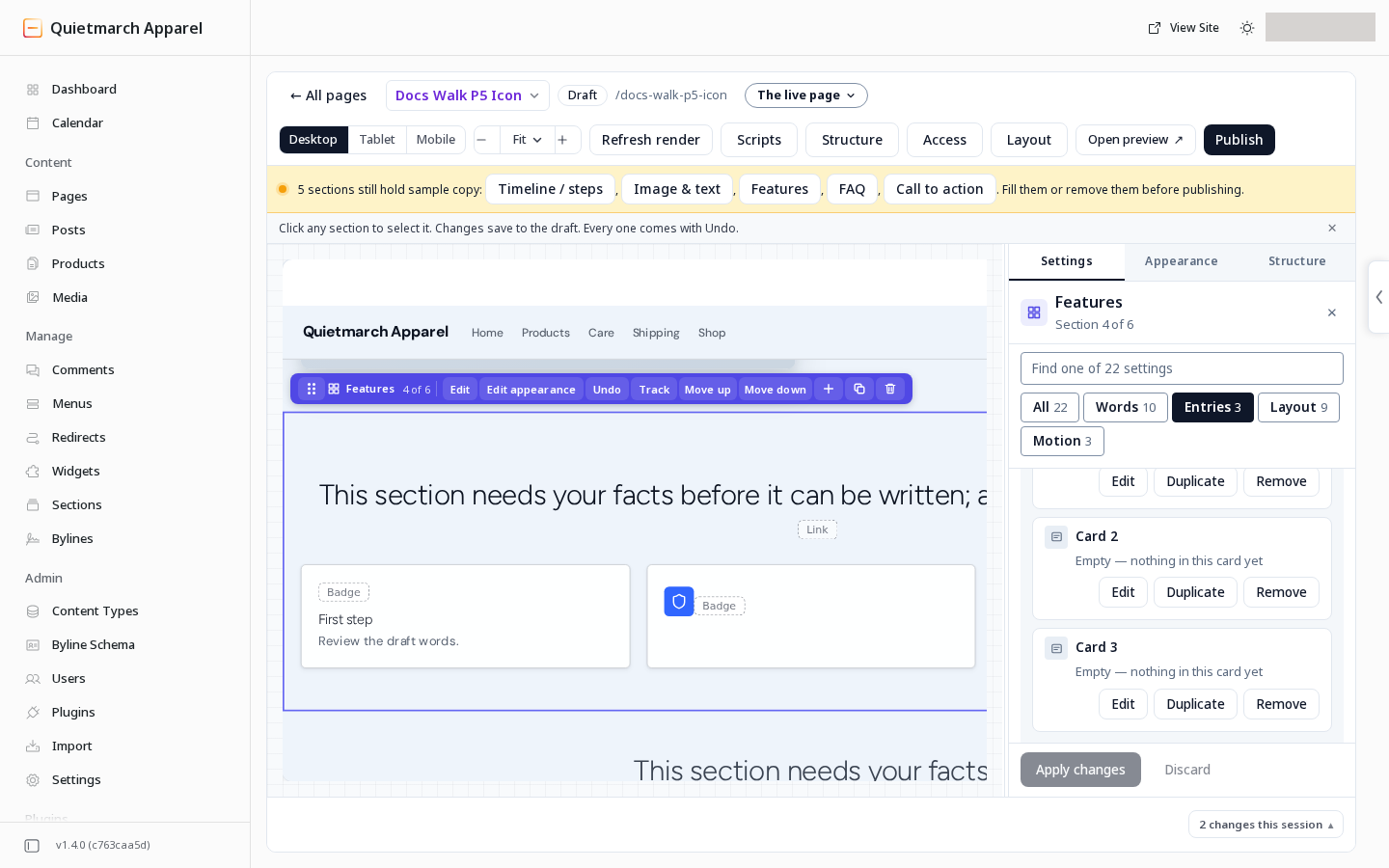
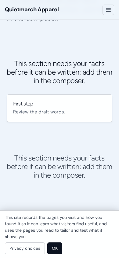
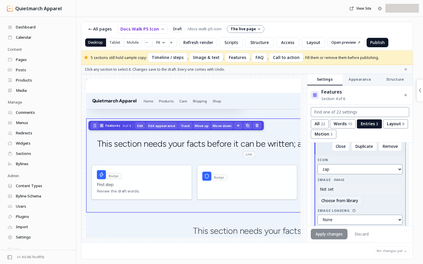
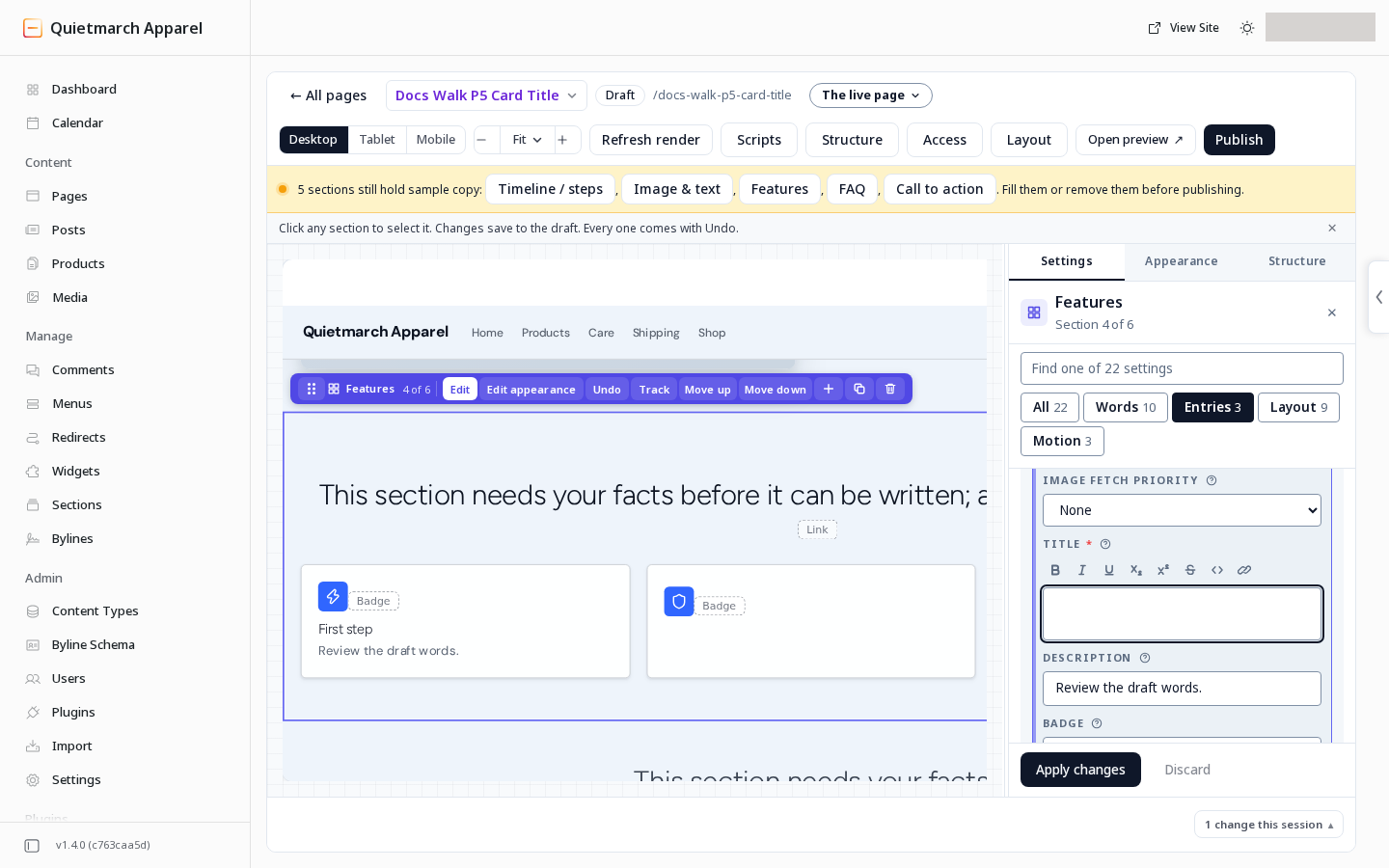
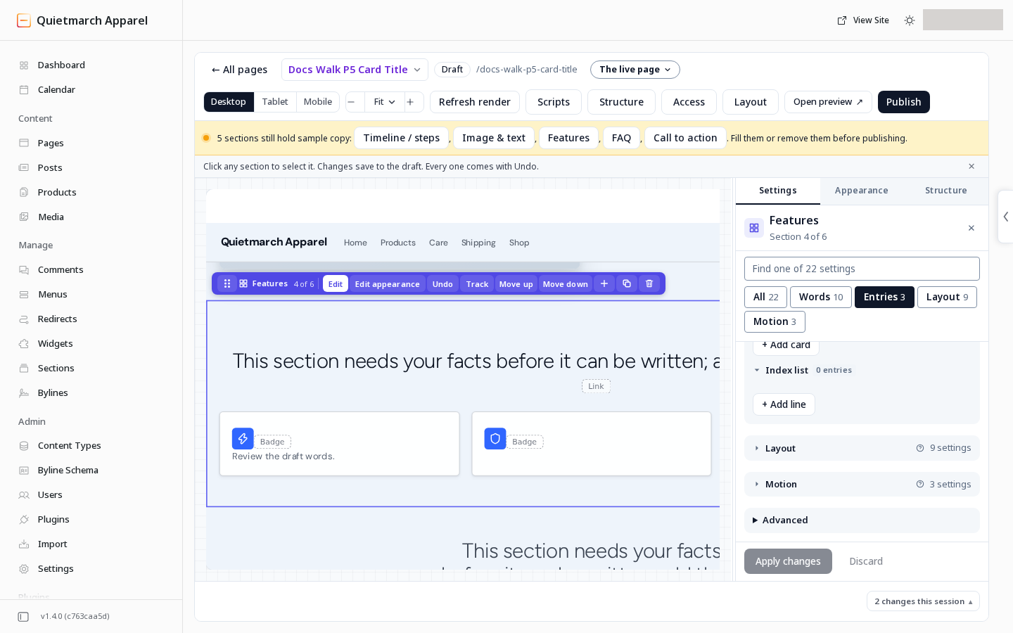
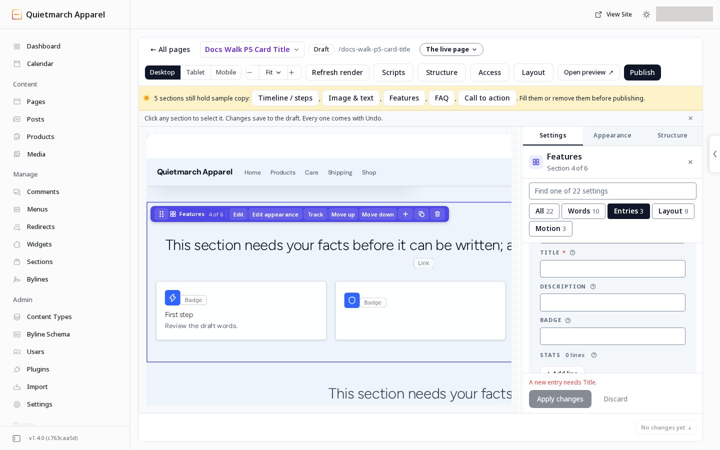
On an existing Features card, you can empty Title and apply the change. A new card still needs a title.
Style the site’s shared parts
Section titled “Style the site’s shared parts”These choices affect shared parts of the site. Read each review card and its timing. A theme or shared header change can affect published pages without a new page publish.
Fonts and small accent text
Section titled “Fonts and small accent text”- Open Theme Studio.
- Open Typography.
- Find Font families.
Interface chooses the face for menus, buttons, labels and form fields. Mono chooses a face for code, figures and small labels.
Both roles start unset. Leaving them empty keeps the fonts those parts already use. If the Interface font is unset, it uses the body font. Code can use the device’s monospace font. The font library includes JetBrains Mono.
Library font files load early, with substitute fonts matched to their size. There is no extra option to enable that delivery.
The page below the header is covered. These recordings show the header during one navigation at each width.
Small accent text uses the theme’s accent ink. The platform can derive an unset accent ink for each colour mode. To set that colour explicitly, ask the copilot to change the theme’s accent ink. There is no dedicated Studio row for it.
Header link and style
Section titled “Header link and style”- Open Site.
- Open Site setup.
- Header link adds a text link after the menu. Set The link’s words and Where it goes. Choose A page of this site or An address. No link is the default. A link to a draft page stays hidden until the page is published.
- Header style offers Standard and Editorial. Standard is the default. Editorial uses a taller header, the Interface font and a wide panel for a menu item with groups.
- Header button remains a separate action button.
A header that keeps an imported design may keep that design’s own controls.
Menu descriptions and panel intro
Section titled “Menu descriptions and panel intro”In the Navigation builder, open a link’s details. Description of followed by the link’s name adds one line below that link.
For a top-level item that holds groups, Panel intro offers Small label, Title, Paragraph, Link words, Link address, Card label, Card title and Card address. All start empty.
These words appear in an Editorial header’s menu panel. The intro occupies a column beside the link groups on a wide screen. Review the menu draft and its publication separately from a page draft.
Footer columns
Section titled “Footer columns”In Site setup, Footer layout offers Links in a row and Columns. Links in a row is the default.
With Columns, each footer menu item that has child links becomes a column, up to five beside the brand. Edit those links in the Navigation builder. Footer note adds words in the bar below the columns. It starts empty and is shown only with Columns.
The theme’s footer brand colour can give the site name its own colour. When unset, it follows the footer heading colour.
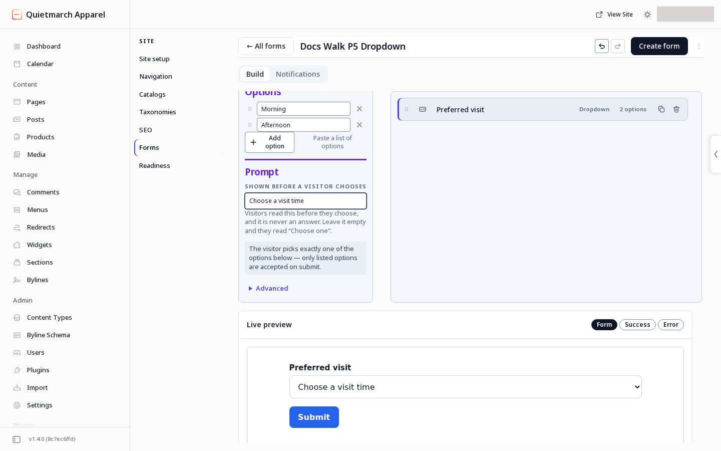
Give a dropdown its first words
Section titled “Give a dropdown its first words”- Open Site.
- Open Forms.
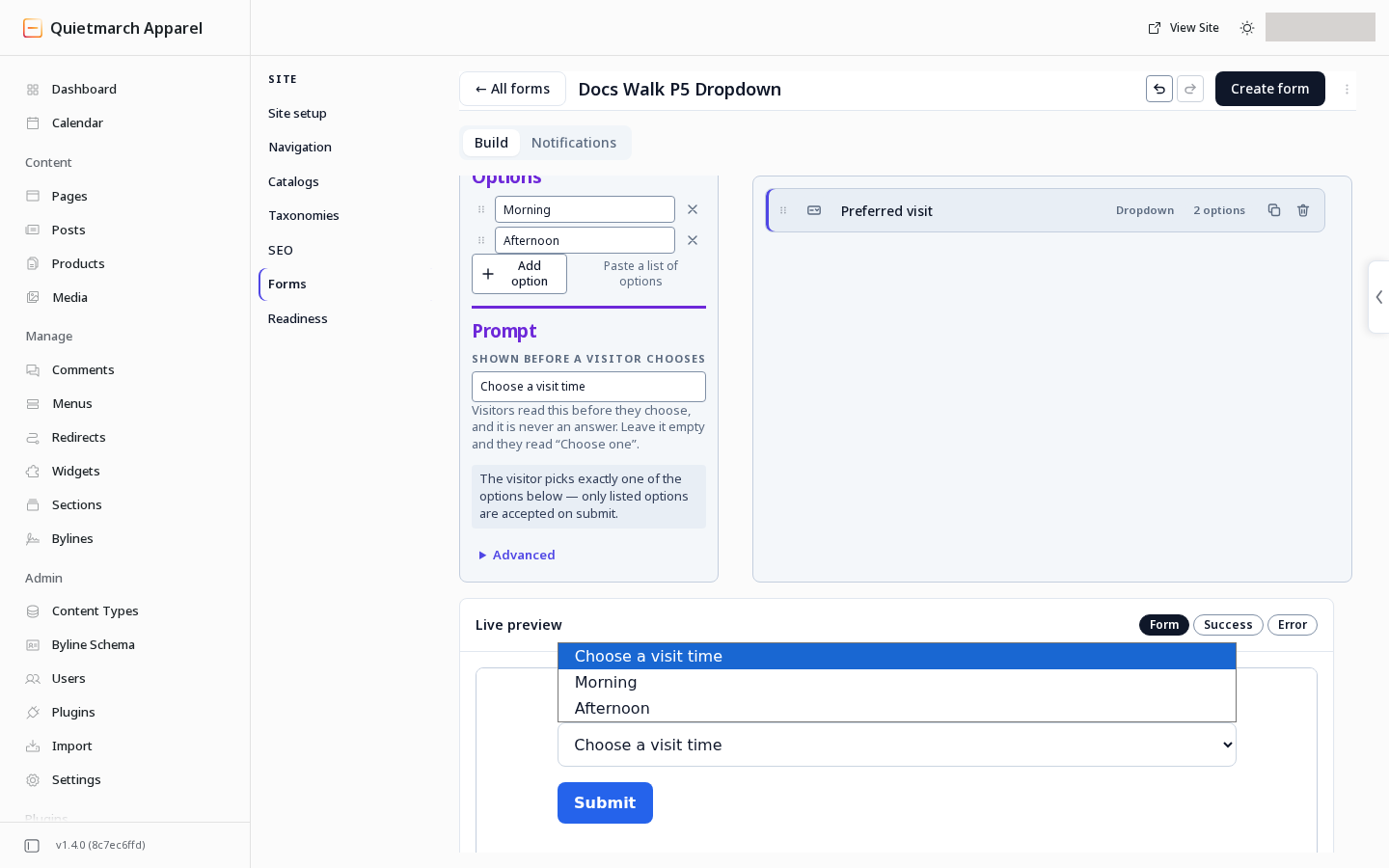
- Edit a Dropdown field.
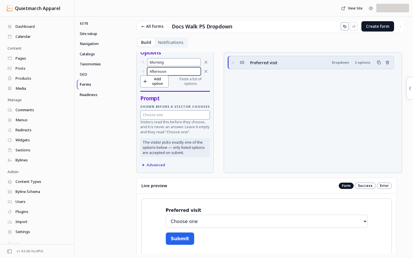
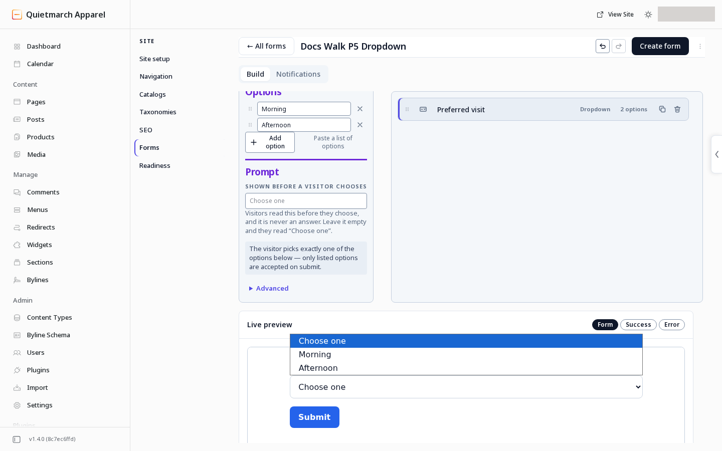
Prompt contains Shown before a visitor chooses.
Leave it empty for Choose one, or write your own prompt. The prompt is not an answer and must differ from the choices visitors can submit.
Work with the copilot
Section titled “Work with the copilot”Give the copilot the words, pictures and layout you want. For page and section choices, its edits save to the page draft.
-
If the copilot changes a page while you hold unapplied words, the Composer keeps your edit open and offers Show the latest. Finish or discard your local edit before reconciling the newer page.
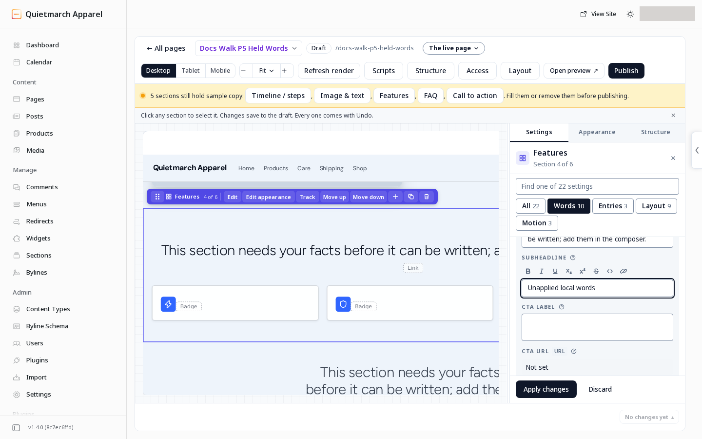
Keep track of words that are still only in the editor. 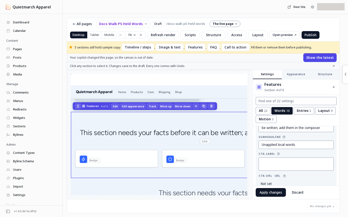
A newer draft is available; the unapplied words remain in their field. 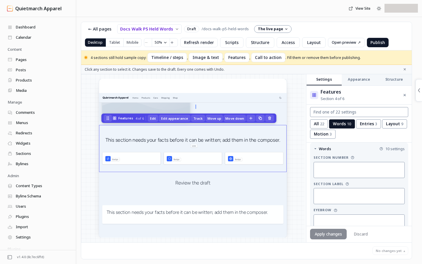
Finish the local edit before reconciling the newer draft. 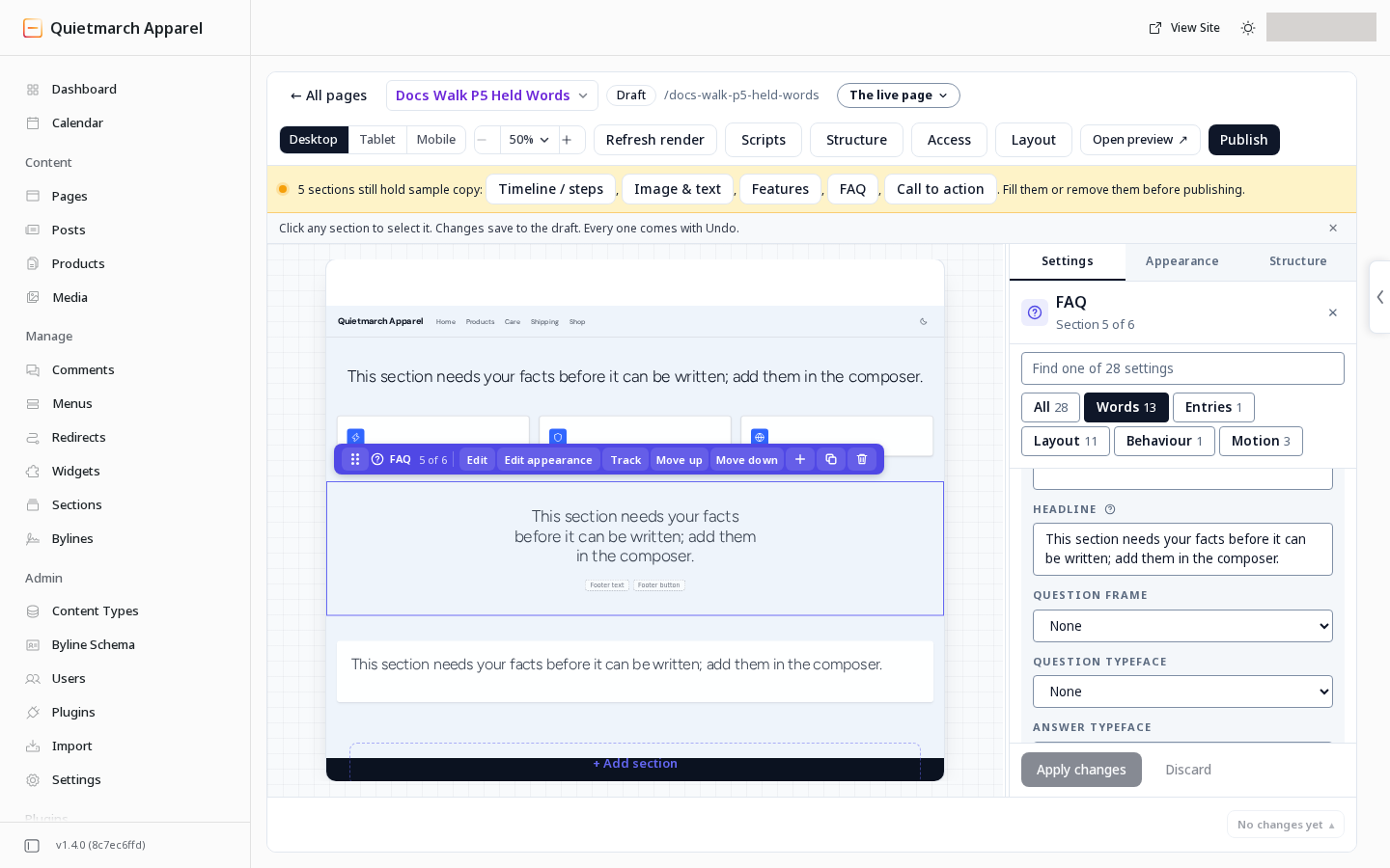
Undo restores the earlier draft words. -
If a build stops before all sections are written, read its account of what remains. When it can read the unfinished sections, it names them so you can ask it to carry on.
-
Missing pictures are left out and named. The copilot does not fill a picture slot with a stock placeholder.
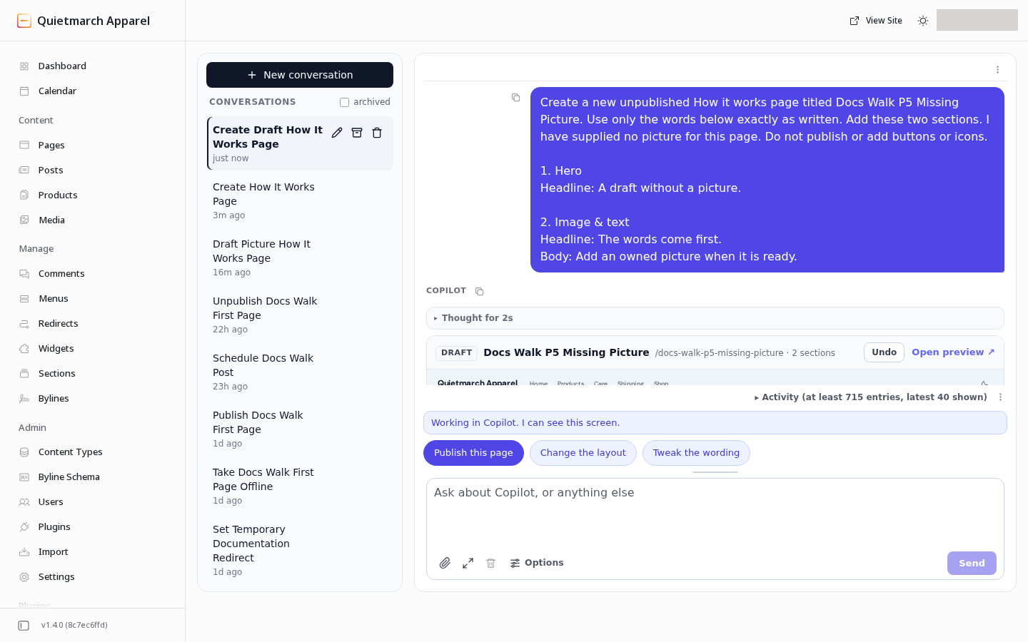
Give the words even when you do not yet have an owned picture. 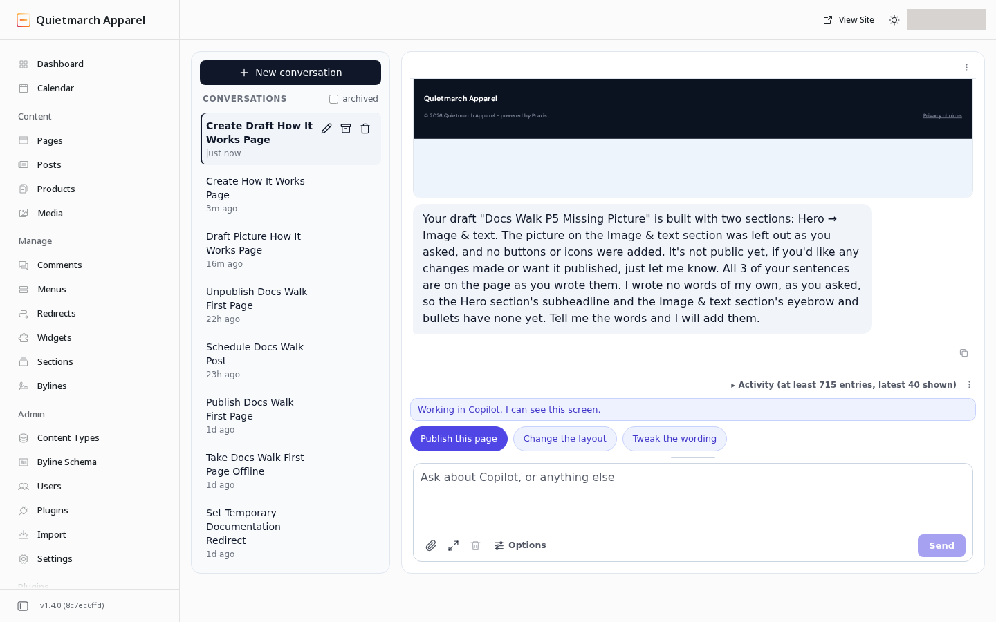
Read what still needs your picture before continuing. 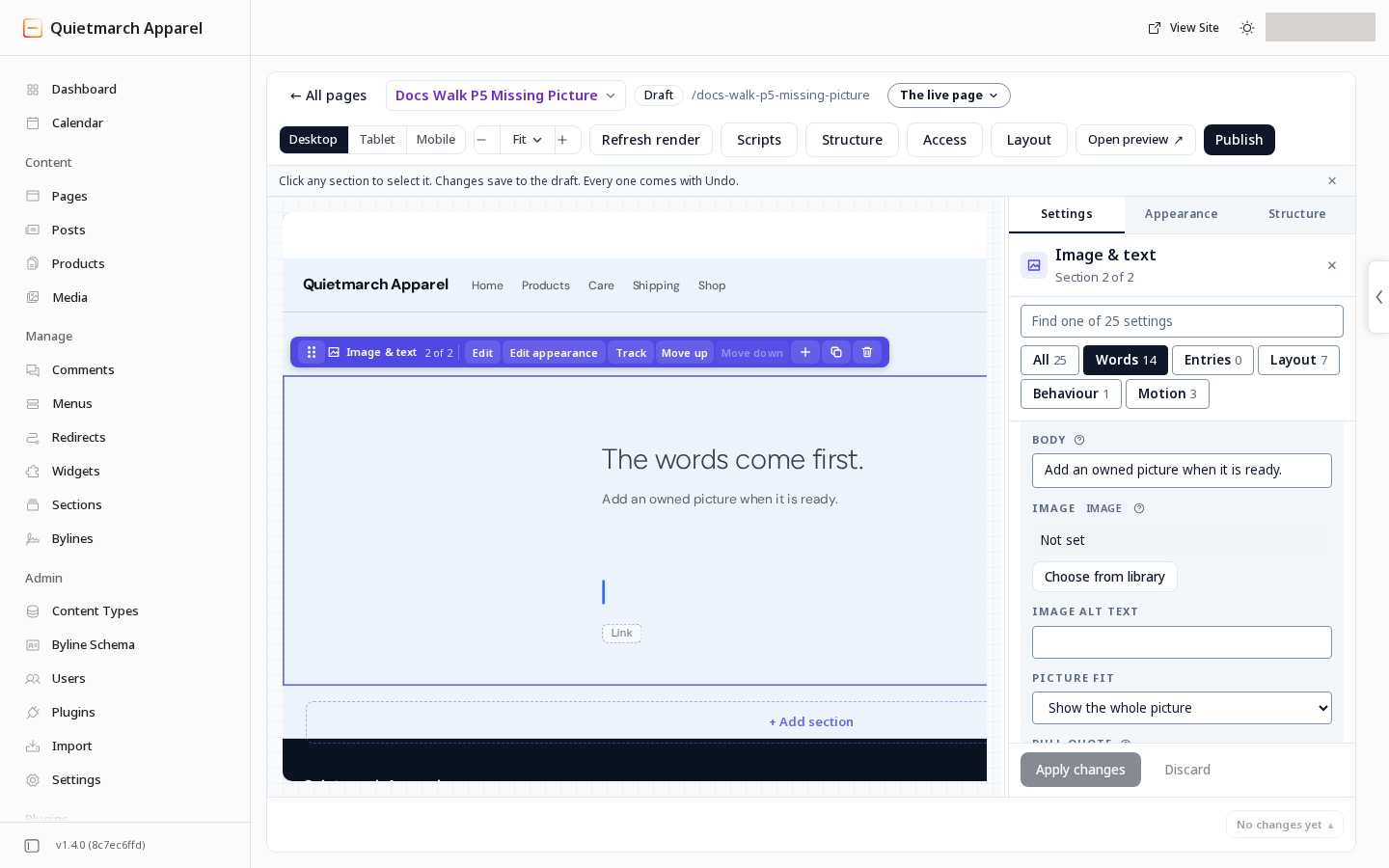
An empty picture slot is left for your own picture. Empty galleries. On a site that was not migrated, a native Gallery with no pictures is left out of the public page, including its heading and band. That includes a strip whose last photo you cleared. Composer keeps a Picture slot while you add images. The draft preview follows the public behavior. A carousel with pictures keeps its empty slides. Pages brought over from another system, called migrated pages, keep their earlier rendering.
-
When you provide exact words, the copilot checks which were placed and reports missing or changed words. Review that account alongside the draft.
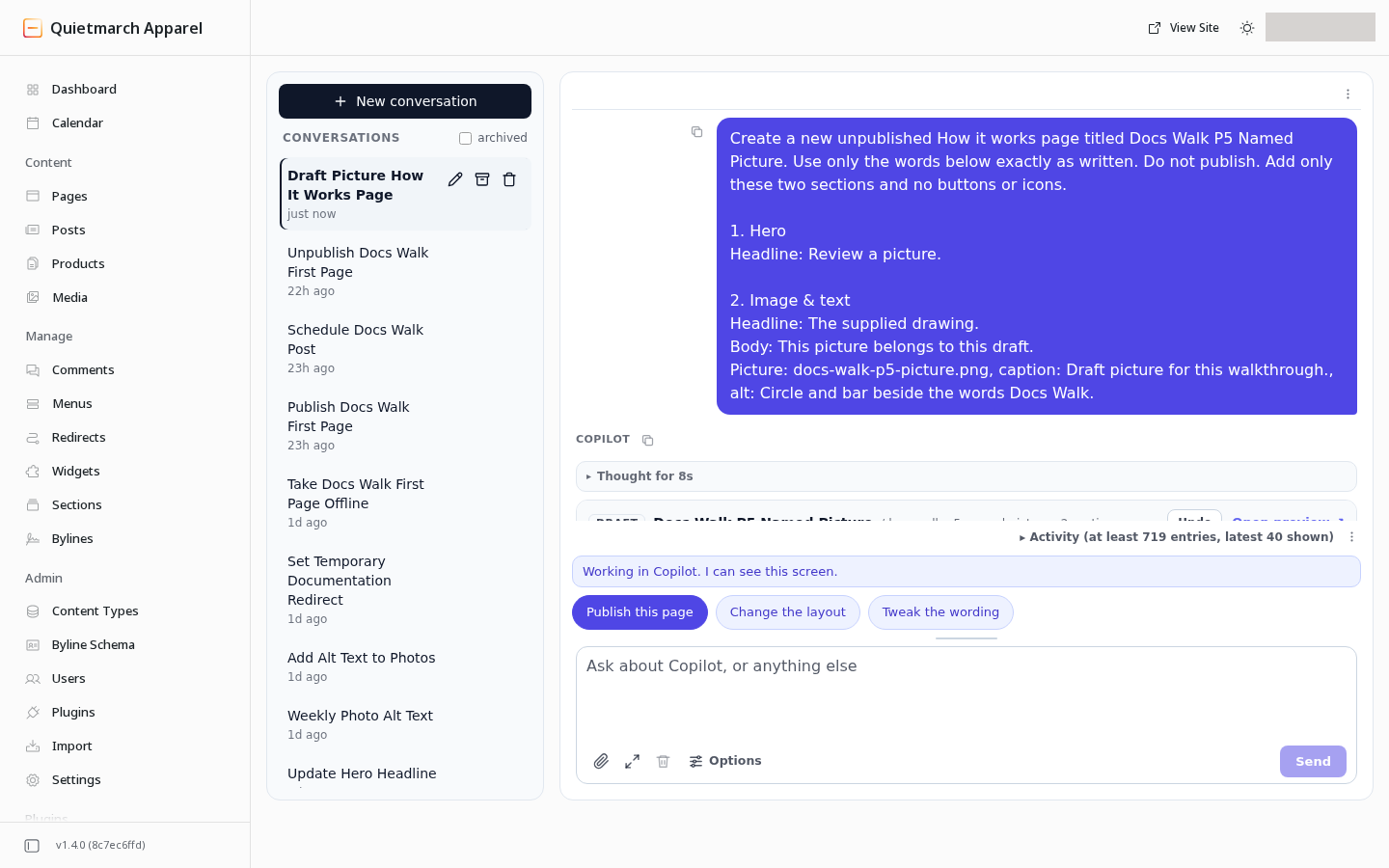
Give the picture’s name and the words that belong with it. 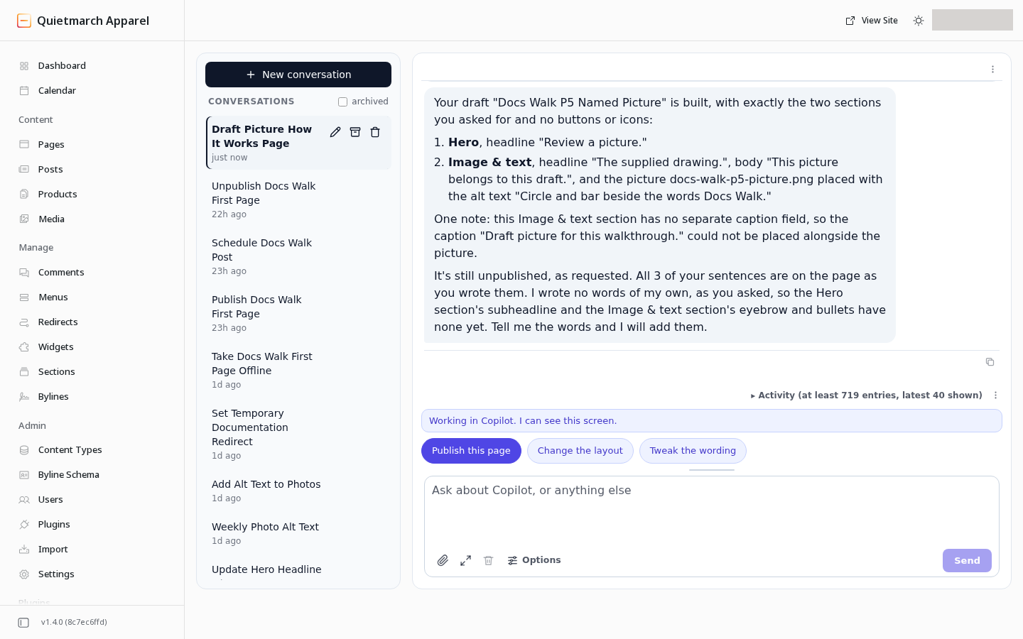
Read the result alongside the draft rather than assuming the picture was matched. 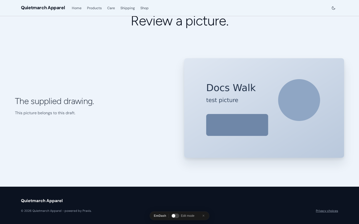
Check that the intended picture and words landed together. 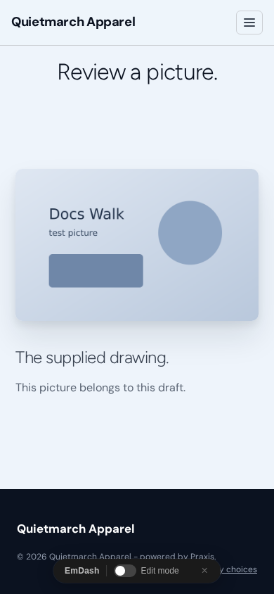
Review the result at phone width before publishing. 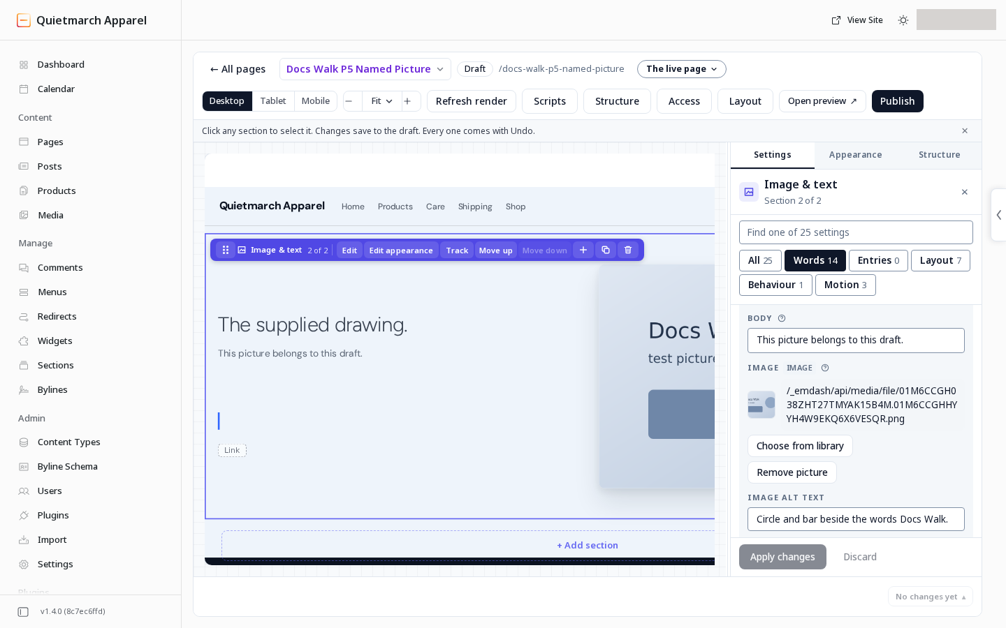
Check the section’s saved words as well as its appearance. 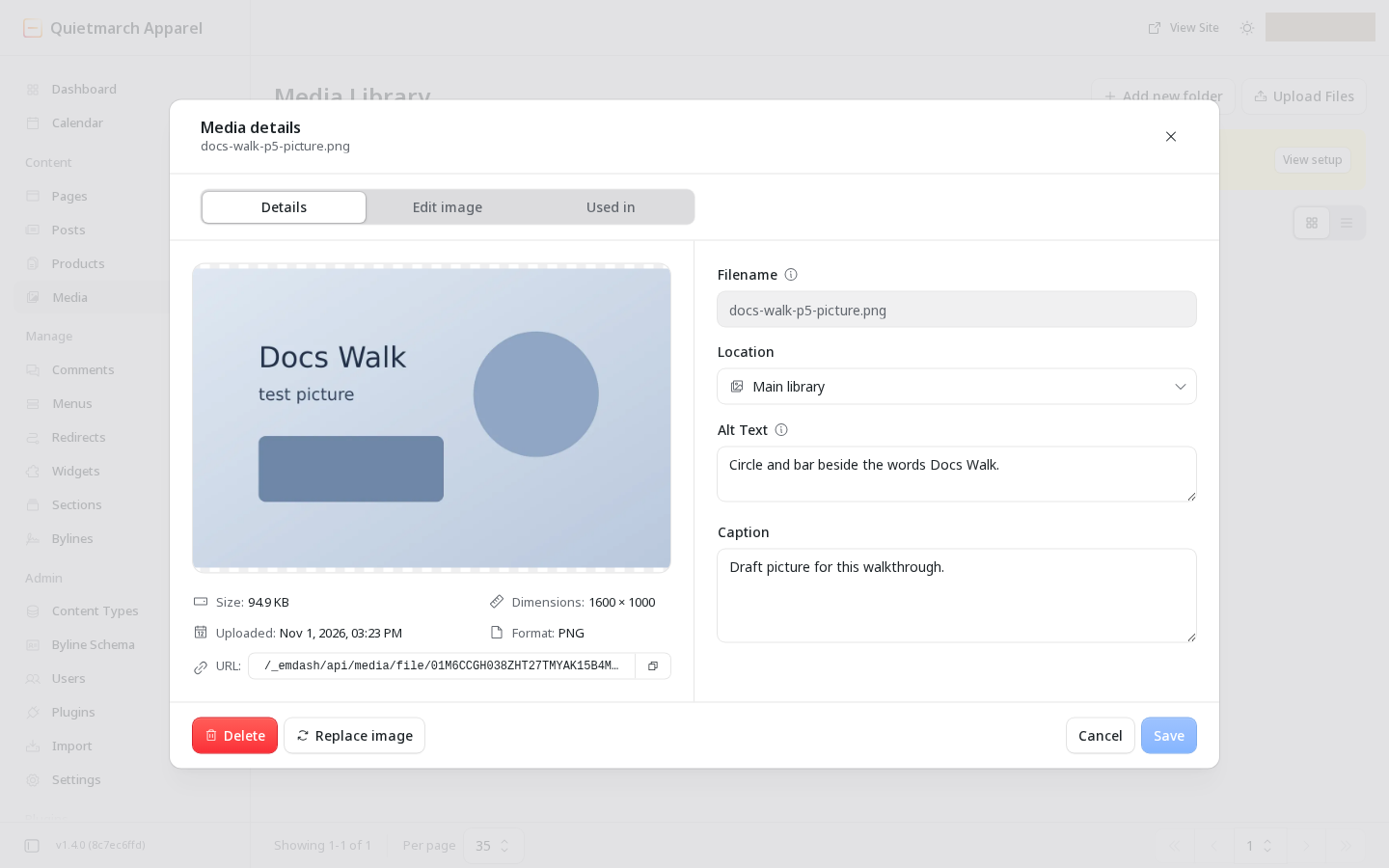
The named picture comes from the site’s media library. -
Instructions about where words belong stay instructions. Ask for the arrangement and provide the text for each part.
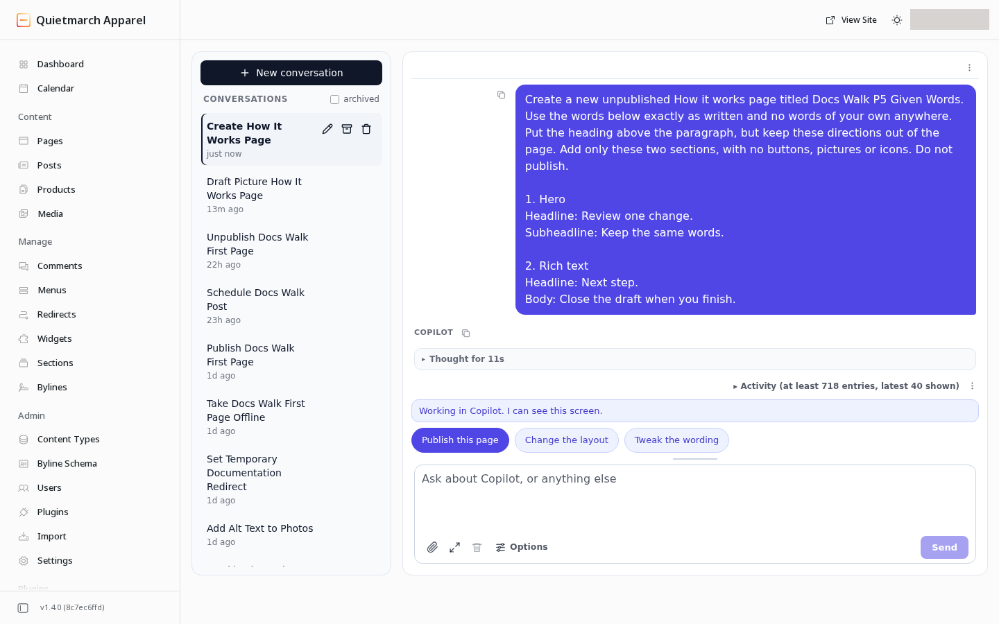
Say which words belong on the page and which lines are directions. 
The page keeps the supplied words in their intended parts. 
Read the actual words at phone width too. Check every supplied sentence in the draft itself.
-
A card that expires or is replaced is described in that state. It is not counted as a decline by you.
-
Activity names the time zone for its timestamps. Read the status message for the outcome of that action.
Changes to the site’s head settings, or their Undo, made in Head & CSP can ask for some cached public pages to refresh. An approved change in chat can ask too. Follow the receipt’s timing message; a faster refresh is not guaranteed.
For the complete choices and defaults, see Layout styles reference. For activating a shared design, see Themes and tokens.