Checked against the product’s code on 7 November 2026.
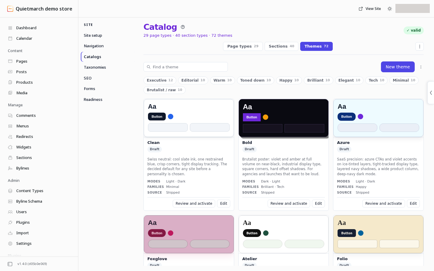
Learn how to change your site colours or fonts. Open Site > Catalogs > Themes in the site admin. Edit a theme’s shared design choices, review the result and decide whether to make it active.
A theme holds the design choices shared across your site. A token is one named choice, such as a text colour, heading font, spacing step or corner radius.
The active theme affects the live site. Publishing one page is a separate action.
Open the theme library
Section titled “Open the theme library”- Open Site.
- Open Catalogs.
- Open Themes.
- Choose Edit on a theme to open Theme Studio, or New theme to create one.
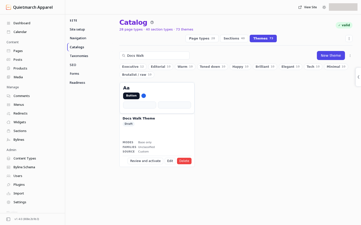
A theme is Draft or Active. Only one theme is active for the site at a time. Activating another returns the previous active theme to draft.
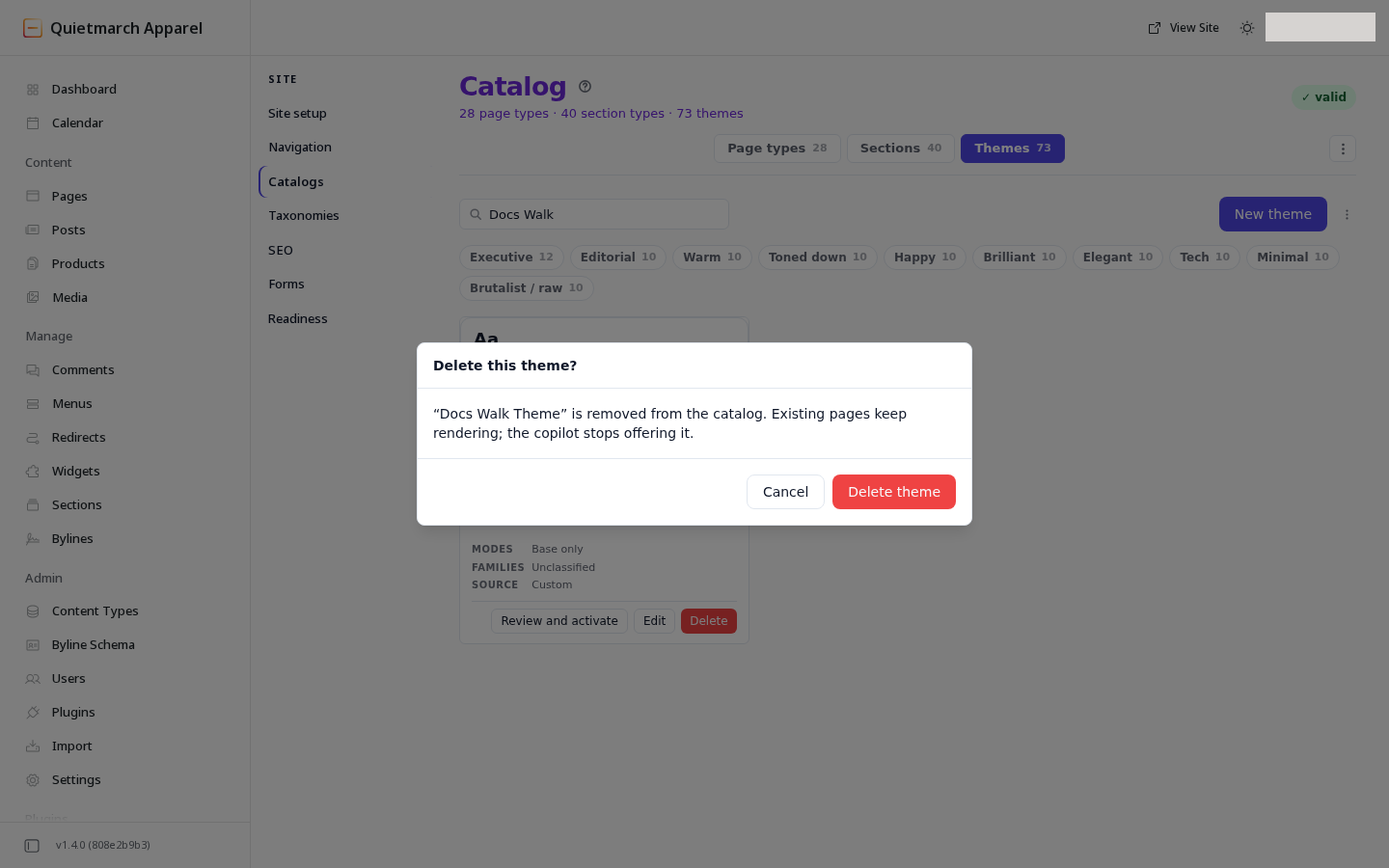
Delete appears only on a theme you created. It asks first with Delete this theme? and cannot be undone.
Edit tokens
Section titled “Edit tokens”Theme Studio offers these sections:
| Section | What it controls |
|---|---|
| Colors | The theme’s named colour roles. |
| Typography | Fonts and type sizes. |
| Spacing | The spacing scale. |
| Radius & shadows | Corners and shadows. |
| Layout | Shared layout values. |
| Modes | Named sets of token overrides. |
| Developer | The theme’s definition in JSON, a structured text format used by developers. |
A mode uses the base tokens, then overrides the values it changes. Review each mode your site uses.
The preview is a sample that shows the theme’s design choices. It is not a preview of one of your pages. Check a real page after making a theme active.
Check contrast
Section titled “Check contrast”The Colors section shows contrast checks for specific pairs of text and background colours. These checks warn about a pair that falls below its threshold. They do not block saving. An error in the theme’s values, which the studio reports beside the preview, does block saving until it is fixed.
Use them while editing, then review the actual page too. A theme check does not test every possible image, custom colour or content arrangement on that page. Review native forms in each mode too; see Forms and replies.
Library themes can change the header name’s colour, menu text and button text on an accent background to suit their backgrounds. Very tight letter spacing relaxes on smaller headings. Review each mode’s button and menu colours on the real page, including the current link and links under the pointer.
Save a draft
Section titled “Save a draft”For an existing draft, choose Save changes.
For a new theme:
- Enter its name.
- Fill the slug field with lowercase words joined by hyphens, such as
studio-spring. - Choose Create theme.
Saving a draft does not activate it. Save the draft before asking to activate it so the approval card describes the stored theme.
Activate a theme
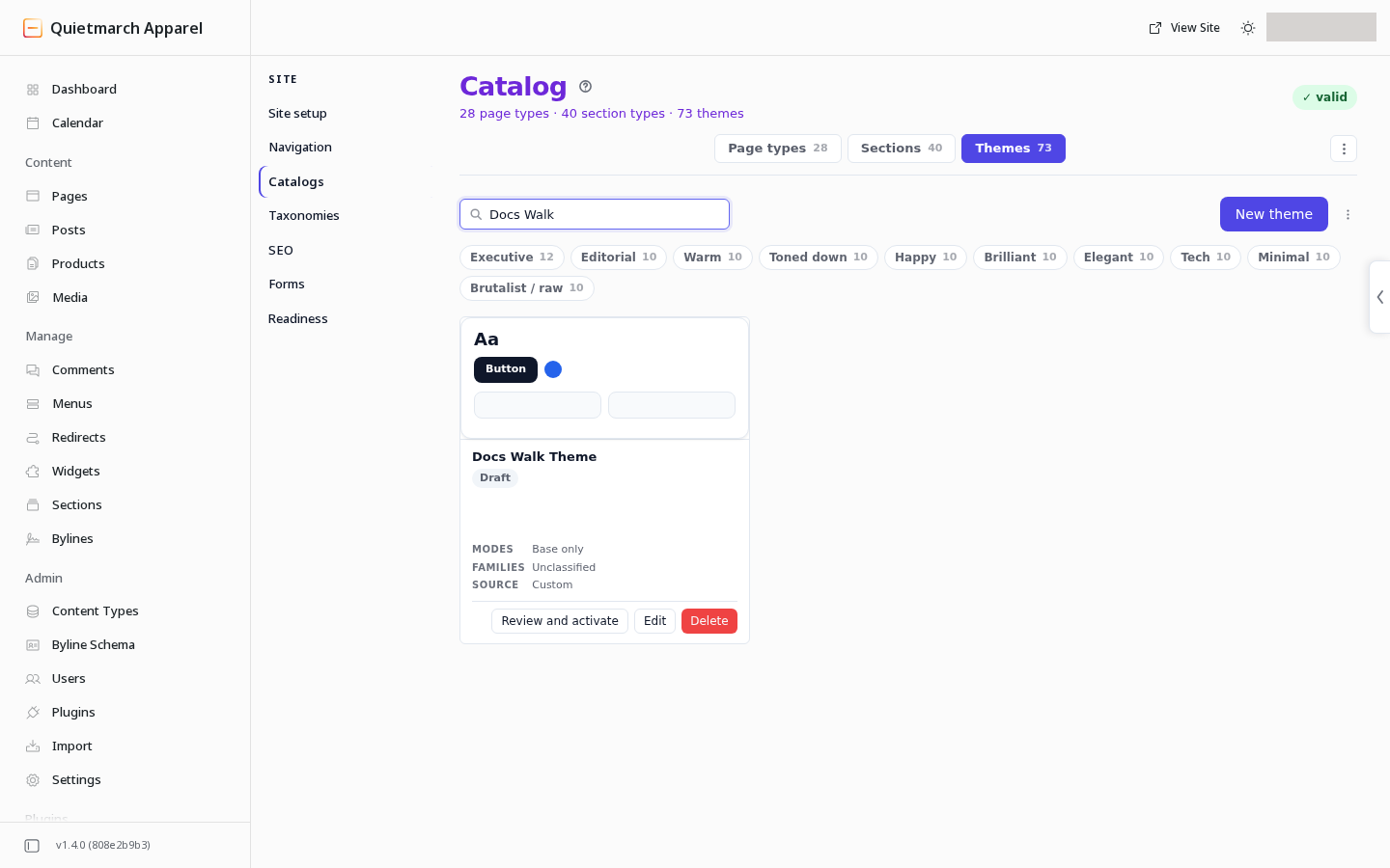
Section titled “Activate a theme”To switch the active theme, choose a saved draft’s Review and activate control and review its approval card.
-
Choose Review and activate on a saved draft, either on its card in the Themes list or in Theme Studio.
-
Read the approval card. It describes the theme being activated and the existing theme returning to draft.
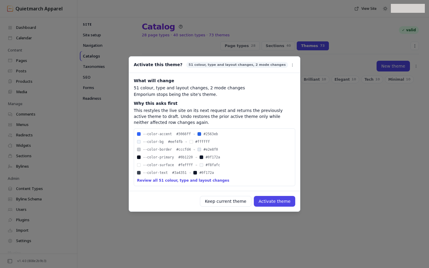
Activation shows what changes before anything restyles the site. -
Review the token changes, then use the card’s confirmation control if you want the theme to become active.
After activation, the Themes list shows a receipt with Undo. Undo puts the earlier active theme back.
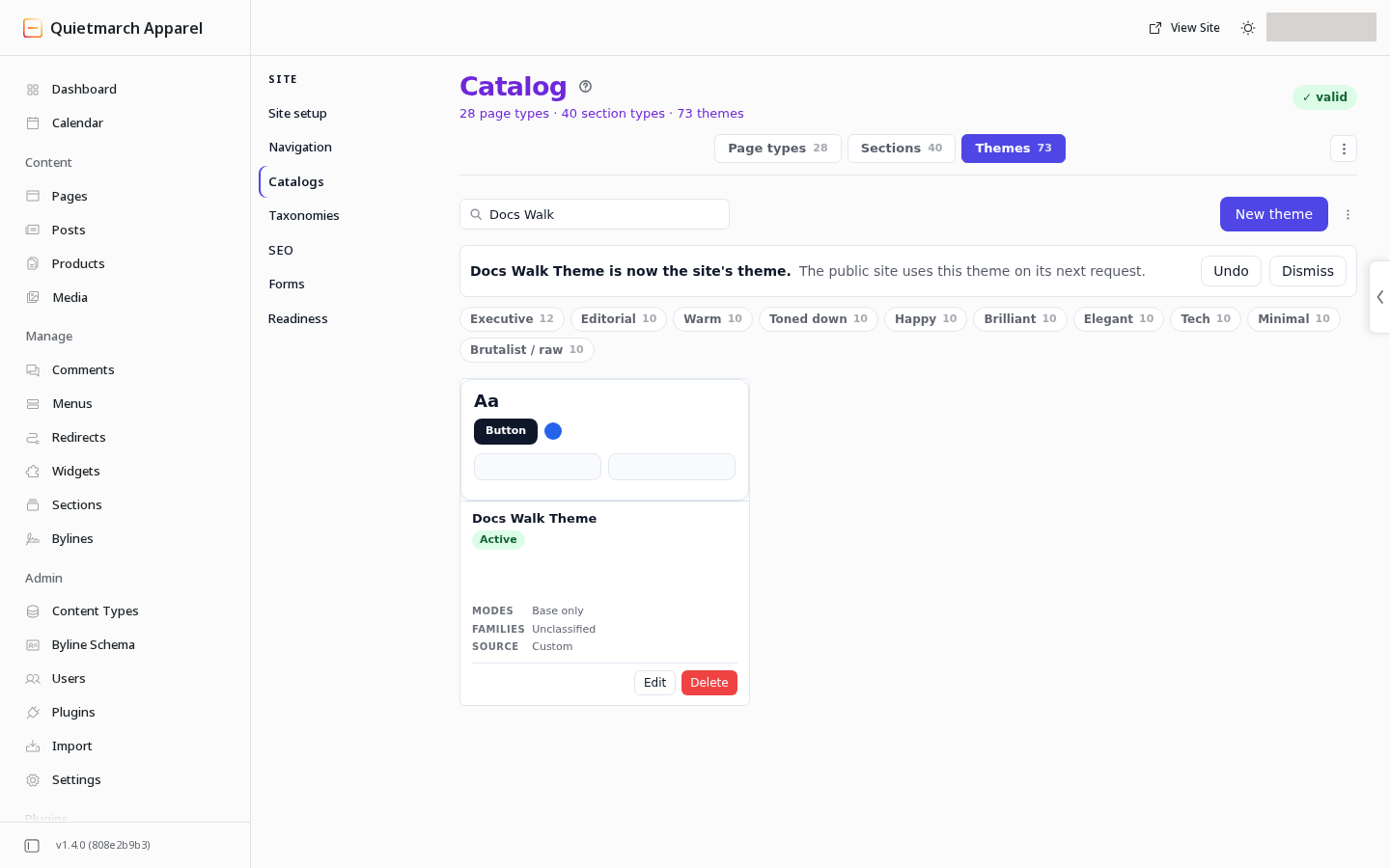
The active theme is saved now. Visitors see the change within the hour, usually much sooner. While the site’s server is down, visitors may see the previous version of a page for up to a day. Theme activation can change the appearance of many published pages without republishing each one.
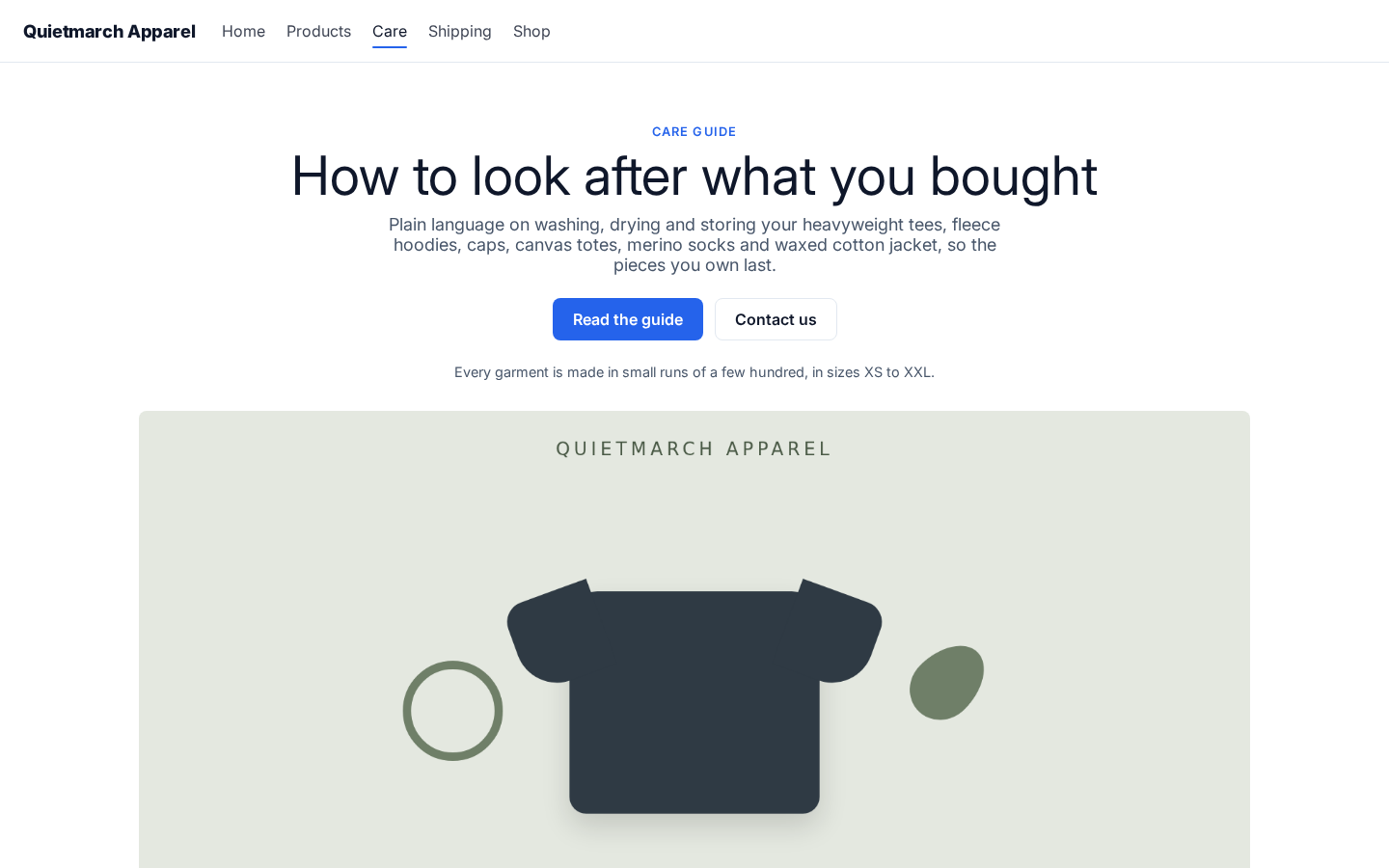
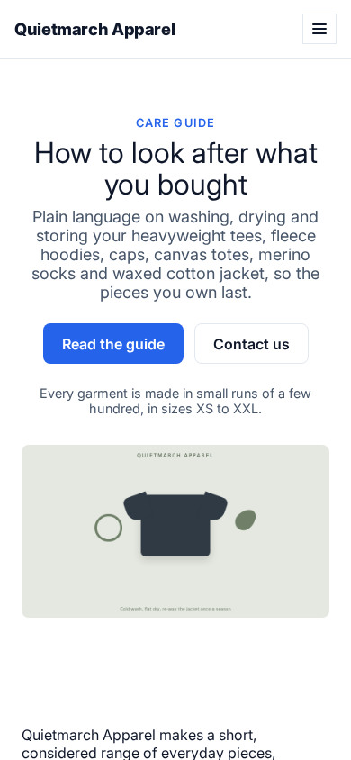
The activated theme gives the primary button a blue background and keeps the heading, buttons and picture within the phone screen.
Edit an active theme carefully
Section titled “Edit an active theme carefully”Choose Save changes after editing an active theme. If its tokens or modes have changed, a Save to the live site? card shows the comparison before saving. That save changes the live theme.
A Theme Studio save has no Undo. To reverse it, change the values back and save again. Review the comparison before confirming a live design change.
For a change to one section rather than the whole theme, use Appearance in the Composer.